Melissa Kenney1, Michael Gerst2, Toni Viskari3, Austin Delaney4, Freya Olsson4, Carl Boettiger5, Quinn Thomas4
1University of Minnesota, 2University of Maryland, 3Finnish Meteorological Institute,4Virginia Tech, 5University of California, Berkeley
With the growth of the EFI NEON Ecological Forecasting Challenge, we have outgrown the current Challenge Dashboard, which was designed to accommodate a smaller set of forecasts and synthesis questions. Thus, we have reenvisioned the next stage of the EFI-RCN NEON Forecast Challenge Dashboard in order to facilitate the ability to answer a wider range of questions that forecast challenge users would be interested in exploring.
The main audience for this dashboard are NEON forecasters, EFI, Forecast Synthesizers, and students in classes or teams participating in the Forecast Challenge. Given this audience, we have identified 3 different dashboard elements that will be important to include:
forecast synthesis overview,
summary metrics about the Forecast challenge, and
self diagnostic platform.
During the June 2023 Unconference in Boulder, our team focused on scoping all three dashboard elements and prototyping the forecast synthesis overview. The objective of the synthesis overview visual platform is to support community learning and emergent theory development. Thus, the synthesis visualizations are aimed at creating a low bar entry for multi-model exploration to understand model performance, identify characteristics that lead to stronger performance than others, the spatial or ecosystems that are more predictable, and temporal forecast validity.
You can view the prototype developed during the meeting HERE and in Figures 1 and 2.
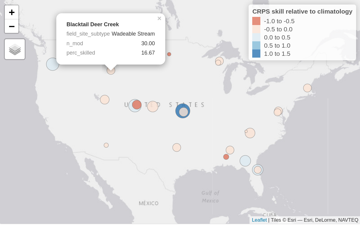
Figure 1. Static image of an interactive map of aggregate forecast skill relative to climatology at each forecasted sites, here showing the water temperature forecasts for the aquatics theme. Bubble colour represents the continuous rank probability score (CRPS) skill relative to climatology with positive values (blues) showing submitted models on average perform better than climatology and negative values showing submitted models perform worse (reds). The size of the bubble represents the percentage of submitted models that outperformed the climatology null (i.e., larger sized bubbles have a higher percentage of skilled models). When hovered over, the bubbles show this percentage (perc_skilled), the site type (field_site_subtype), as well as the total number of models forecasting at that site (n_mod).
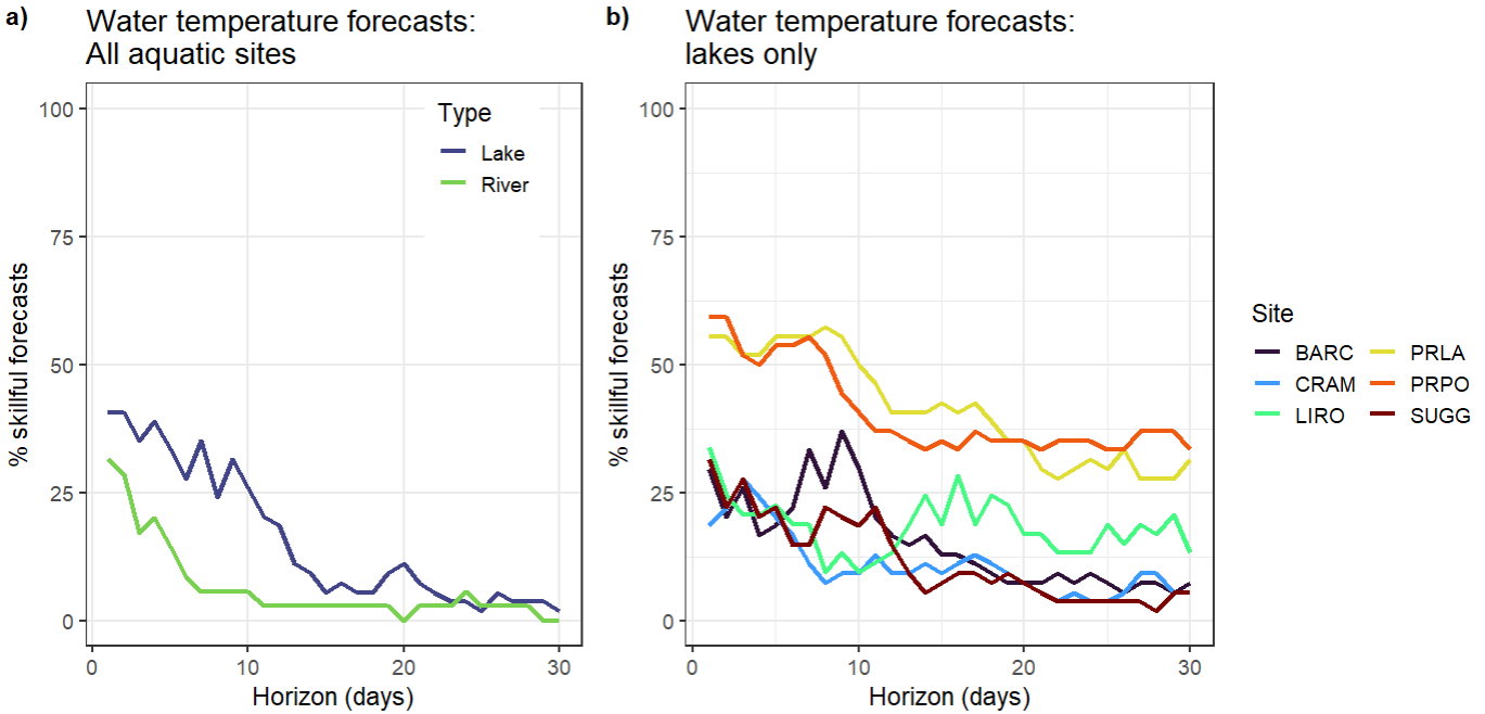
Figure 2. a) Percentage of submitted models that are classed as ‘skillful’ (outperform the null climatology forecast based on the continuous rank probability score metric) at the river (n=27) and lake sites (n=6) for water temperature forecasts at each horizon from 1 to 30 days ahead. b) Percentage of submitted models that are classed as ‘skillful’ for water temperature forecasts at six of the lake sites (https://www.neonscience.org/field-sites/explore-field-sites).
Developing these graphics requires aggregation of skill scores.There are a multitude of metrics that can be used to calculate the skill score, which each have their own benefits and flaws. Thus, there should be multiple skill scores for different metrics with clear presentation of what metric is used at a given visualization. Additionally, in order to isolate what sites are more interesting from a model development perspective, there needs to be a comparison of how many of the models meet a baseline skill score at a given site at a chosen time frame. That allows isolating challenge areas and also easily informs which models really succeed at situations where others struggle. For better future analysis of how models perform at certain sites, we also envisage the visualization to include the skill scores for the relevant drivers (NOAA weather) for comparison. For example, if we see a drop in skill across models in water temperature projections after some time, there should be a direct method to assess if this reflects overall flawed model dynamics or if the weather forecast driving the water temperature loses its reliability. This also allows the user to approximate a maximum length in which the model performance analysis is at all useful.
In addition to the main synthesis overview, the goal of this platform is to support exploration of synthesis data. For all themes, there was general agreement that it would be useful to pull up at a glance, site characteristics, a photo, and basic summary statistics about the number of models and model performance.
During the meeting, we worked with the Aquatics and Beetles Challenge teams to identify some of the key data aggregation groupings that will be important to facilitate exploration. One important distinction arose during the conversations – the baseline model, time scale, and data latency. For Aquatics there is a long time series of data that create a climatology and data are provided relatively quickly via data loggers. For Beetles, there is a different null baseline model given the length of historic data that is different at each site and it takes a year to provide beetle abundance and richness assessment. There was also a desire to have specific types of synthesis visualizations including the species accumulation curve over years, 3-year running average, and indicating the lower and upper bounds of a particular variable (use in scale). Thus, for both Beetles and Aquatics there are similarities and differences in the types of groupings that would be most useful to support synthesis exploration.
Table 1. Different data groupings that would be useful to facilitate easy-to-develop synthesis visualizations of the EFI-NEON Forecast Challenge models to facilitate learning and community theory development.
Groupings
All Themes
Aquatics
Beetles
Team / Challenge
theme, site, model ID, customized classroom or team groupings
particular variables (e.g., DO) within a theme
Spatial / Ecosystems
sites, NEON domains, site type (river, stream, lake…), altitude (high vs lowlands)
sites by distance, dominant NLCD classification
Temporal Scale
average for past year, seasonal groupings,
1 day, 5 days, 7 days, 15 days, 30 days
14 days, growing season, multi-year (up to 5 year) forecasts
Models
best model at each site, model inputs, model structure, functional type, output uncertainty representation
model run time, model computational requirements
Skill Scoring
current skill forecast approaches, better than climatology/null baseline,
comparison of your model to the best forecast
Other Features
environmental variables and weather forecast observations
comparison with weather/climate forecast skill
disturbance events (e.g., widlfire), growing season dates at each sites, site disturbance characteristics (e.g., mowing, fencing)
In addition to the synthesis overview, there were two complementary and linked platforms that will create the dashboard. First, the objective of the forecast challenge overview is to provide a basic summary of metrics related to the overall EFI NEON Ecological Forecasting Challenge. Specifically, the metrics that would be included are: number of forecasts submitted, number of unique teams, percentage (or median of all) of models that are better than climatology or a null model per theme, and total forecast and observation pairs.
Second, the objective of the self-diagnositic platform is to provide an overview for individuals or team forecast contributions and performance. The types of summaries that will be provided for the forecasters are: confirmation of forecast submission, date of the most recent forecast submitted for a model, model performance relative to climatology or null model, model prediction versus observation, model performance vs other selected models, and model skill over a specific time horizon (to assess whether it performs better over time).
Overall, the goal of the re-envisioned visual dashboard is to create platforms that will allow us to track challenge engagement, individually or as a team diagnose any model submission problems and performance improvement opportunities, and support community theory development through a synthesis given the range of models submitted through the EFI NEON Ecological Forecasting Challenge. Long-term, if this platform structure is useful and robust, it could be applied to other systems where there are multi-model predictions and there is a desire to collaboratively learn together to improve our theoretical understanding and forecasts to support decision-making.
We are looking for input from the EFI community on the synthesis dashboard for other themes, to discuss with individuals what synthesis would be most relevant to phenology, terrestrial, and ticks forecasters. Reach out to info@ecoforecast.org to share your thoughts or let us know you would like to join future conversations about updating the dashboard.
Post by: Kelsey Yule; Project Manager, NEON Biorepository and Nico Franz; Principal Investigator, NEON Biorepository
Background. The National Ecological Observatory Network (NEON; https://www.neonscience.org/) is known for producing and publishing 180 (and counting) data products that are openly available to both researchers and the greater public. These data products span scales: individual organisms to whole ecosystems, seconds to decades, and meters to across the continent. They are proving to be a central resource for addressing ecological forecasting challenges. Less well known, however, is that these data products are all either directly the result of or spatially and temporally linked to NEON sampling of physical biological (e.g. microbial, plant, animal) and environmental (e.g. soil, atmospheric deposition) samples at all 81 NEON sites.
The NEON Biorepository at Arizona State University (Tempe, AZ) curates and makes available for research the vast majority of these samples, which consist of over 60 types and number over 100,000 per year. Part of the ASU Biodiversity Knowledge Integration Center and located at the ASU Biocollections, the NEON Biorepository was initiated in late 2018 and has received nearly 200,000 samples to date (corresponding to some 850 identified taxa in our reference classification). Sampling strategies and preservation methods that have resulted in the catalog of NEON Biorepository samples have been designed to facilitate their use in large scale studies of the ecological and evolutionary responses of organisms to change. While many of these samples, such as pinned insects and herbarium vouchers, are characteristic of biocollections, others are atypical and meant to serve researchers who may not have previously considered using natural history collections. These unconventional samples include: environmental samples (e.g. ground belowground biomass and litterfall, particulate mass filters; tissue, blood, hair and fecal samples; DNA extractions; and bulk, unidentified community-level samples (e.g. bycatch from sampling for focal taxa, aquatic and terrestrial microbes). Within the overarching NEON program, examination of these freely available NEON Biorepository samples is the path to forecasting some phenomena, such as the spread of disease and invasive species in non-focal taxonomic groups.
NEON Biorepository samples include: pinned, identified insects; dry soils; bulk, unidentified, ground-dwelling invertebrate community samples; frozen small mammal tissue samples
Sample Use. Critically, the NEON Biorepository can be contrasted with many other biocollections in the allowable and encouraged range of sample uses. For example, some sample types are collected for the express purpose of generating important datasets through analyses that necessitate consumption and even occasionally full destruction. Those of us at the NEON Biorepository are working to expedite sample uptake as early and often as possible. While we hope to maintain a decadal sample time series, we also recognize that the data potential inherent within these samples needs to be unlocked quickly to be maximally useful for ecological forecasting and, therefore, to decision making.
Data portal. In addition to providing access to NEON samples, the NEON Biorepository publishes biodiversity data in several forms on the NEON Biorepository data portal (https://biorepo.neonscience.org/portal/index.php). Users can interact with this portal in several ways: learn more about NEON sample types and collection and preservation methods; search and map available samples; download sample data in the form of Darwin Core records; find sample-associated data collected by other researchers; explore other natural history collections’ data collected from NEON sites; initiate sample loan requests; read sample and data use policies; and contribute and publish their own value-added sample-associated data. While more rapidly publishable NEON field data will likely be a first stop for forecasting needs, the NEON Biorepository data portal will be the only source for data products arising from additional analyses of samples collated across different research groups.
Map results for the spatial and taxonomic distribution of NEON mosquito (Culicidae) specimens currently available for use
Exploration of feasible forecasting collaborations. The NEON Biorepository faces both opportunities and challenges as it navigates its role in the ecological forecasting community. As unforeseen data needs arise, the NEON Biorepository will provide the only remaining physical records allowing us to measure relevant prior conditions. Yet, we are especially keen to collaboratively explore what kinds of forecasting challenges are possible to address now,particularly with regards to biodiversity and community level forecasts. And for those that are not possible now, what is missing and how can we collaborate to fill gaps in raw data and analytical methods? Responses to future forecasting challenges will be strengthened by understanding these parameters as soon as possible. We at the NEON Biorepository actively solicit inquiries by researchers motivated to tackle these opportunities, and our special relationship to NEON Biorepository data can facilitate these efforts. Please contact us with questions, suggestions, and ideas at biorepo@asu.edu.
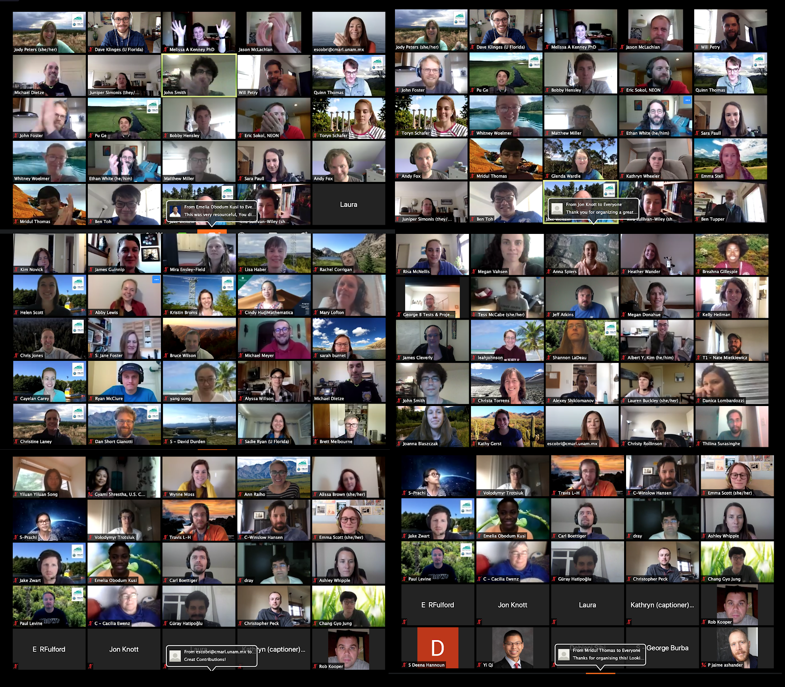
On May 12 and 13 our NSF-funded EFI Research Coordination Network (RCN) hosted a virtual workshop, “Ecological Forecasting Initiative 2020: Coordinating the NEON-enabled forecasting challenge”. This workshop replaced the three day in-person workshop that was scheduled at the same time, but which was canceled due to COVID-19. Going virtual allowed us to increase our participation and diversity. We were originally space-limited to 65 in-person participants, but with our virtual meeting, we had a little over 200 people register to access the workshop materials, with 150 individuals consistently joining on Day 1 and 110 individuals who consistently participated on Day 2. We also welcomed participants from around the globe with almost 10% of participants calling in from outside the U.S. And instead of being limited to 15 graduate student participants, we ended up with over 50 graduate students who participated in the meeting. While EFI has been using Zoom from the beginning and the EFI-RCN leadership committee members are constantly on Zoom for calls and online courses, this was a much larger gathering than any of us had organized previously. To help others as their workshops are embracing the virtual format, we reflected on the key elements that allowed the workshop logistics and technology flow smoothly. We hope you find our tips useful! If you have any additional questions feel free to reach out to us at eco4cast.initiative@gmail.com.
Thanks to Dave Klinges (University of Florida) who captured these screenshots of 6 screens of Zoom boxes.
Prepping for the Meeting
Get input from many perspectives. There are a number of great suggestions online about hosting virtual workshops. To prepare for the virtual format, multiple leadership committee members took a free 1 hr class on running virtual scientific meetings. You can find the video and slides from the class here https://knowinnovation.com/2020/03/you-too-can-go-virtual/. Alycia Crall from NEON was hugely helpful with ideas like QUBES and Poll Everywhere. Lauren Swanson from Poll Everywhere provided a tutorial on how to use the different features of Poll Everywhere and helped us to test the polls before the workshop. Julie Vecchio, from the Navari Family Center for Digital Scholarship for the Hesburgh Libraries at the University of Notre Dame, shared an example slide deck and script for sharing virtual logistics at the beginning of a workshop. And Google was a great resource for finding additional input along the way.
Scale your goals to the format and your objectives. Our goal for the original in-person meeting was to finalize rules for the NEON Forecasting Challenge but we knew that this was not possible virtually. However, the virtual meeting allowed us to have more people and more perspectives for idea generation. Therefore, our goals shifted to brainstorming so that we could leverage perspectives from the diverse attendees. We now have a ton of work to do synthesizing the input but we have a better pulse of what the community is interested in. Recognizing the challenge of engaging attendees virtually over long periods of time, we reduced the original 3-day in person meeting to a 2-day meeting with a schedule that was conducive to participants from east to west coasts of the U.S.
Virtual meetings require as much or more prep than in-person meetings. Be prepared for a lot of planning before the meeting.
General Meeting Set-up
Don’t go all day. Our first day was 6 hours and the second day was only 4 hours and the hours were set to accommodate people from the U.S. east and west coast time zones. Unfortunately, there is no good time for all global participants, but we were thrilled to see so many participants who woke up early or stayed up late to join us from outside the U.S.
Incorporate plenty of breaks. Virtual meetings are more tiring than in-person meetings. We had two longer 30-minute breaks that corresponded to lunch-times on the U.S. east and west coasts as well as shorter 15-minute breaks spread throughout both days.
Have a production manager for the meeting. This person focuses on set up and running the technical logistics. For example, this person stays in the main room during breakouts to provide assistance and oversee the timing of activities. Having a production manager allows the meeting lead (i.e., project Principal Investigator) to be the M.C. of the meeting and do real time synthesis of the ideas without having to worry about meeting logistics.
Create a minute-by-minute script for the entire meeting. This includes both the public Agenda and the behind the scenes tasks. For example, we wrote out the messages that would be sent through Zoom Chat/Breakout messaging with the time that each message would be sent. You should be able to articulate in writing what is going to happen at every moment of the meeting before the meeting starts and assign who is going to do each task.
Pre-record talks and add edited closed captioning. This prevents issues that come with live talks like bad mics or bad connections. This also keeps the meeting on schedule and avoids the awkward need to cut someone off. We felt the talks were better because they were pre-recorded and, for the talks that presenters agreed to share, we now have an excellent resource for folks that missed the meeting. The pre-recorded talks may require editing, so find someone with resources and time to make edits prior to the meeting. We made playlists for each plenary session available as unlisted videos on YouTube for any workshop participant that had connection issues while the videos were being played.
Be prepared to pay for a closed captioning service so that the meeting is accessible. In the registration form for the meeting, ask if anyone needs CC and if they do, hire a service. We were able to find a service through our university (Virginia Tech) vendor system that worked well (www.ACSCaptions.com). The production manager moved the captioner to be in the same Breakout as those that requested the service. CC is also nice, because you get the full record of text right after the meeting, instead of waiting for the Zoom transcript to come through, plus the captioner’s transcription is better than the automatic Zoom transcript.
Use hardwired internet. Our production manager/meeting host used a computer that was connected to the internet via a wire – this will reduce the chance that the central person loses connection.
Plan for leadership team meetings during the workshop. The leadership committee met for 1 hour before and 30 minutes after the meeting each day to go over last minute logistics and any adjustments that were needed. Set up a separate Zoom meeting for these calls to avoid participants joining at times when you are not prepared for them.
Zoom worked great. While we know that there are other conferencing platforms, we used Zoom Meeting with a 300 person limit, hosted through the University of Notre Dame. We chose Zoom Meeting over Zoom Webinar, because we wanted the ability for workshop participants to interact during breakouts. Plus it was provided by the University, and did not require the additional set-up or payment that Zoom Webinar required. It worked very well. There were some individuals that could not access Zoom. Therefore, we also streamed the workshop from Zoom to YouTube and shared the YouTube live link with individuals in our group who had registered for the workshop materials.
But Zoom can break communication lines among the host and leadership committee. Have an off Zoom and off computer way for the leadership team to communicate throughout the meeting (like text messaging to phones). It is important to turn off notifications on the host/co-hosts computer due to screen sharing and sounds, but that can leave the production manager or leadership team flying blind unless there is an alternative way to communicate. Leadership committee members that are in Breakout Rooms are unable to message the host in Zoom.
Assign leadership committee members as co-hosts. Assign all leadership members as co-hosts and have them mute people who are not talking but have background sounds. Leadership members can also help with spotlighting the speakers and can also move from breakout room to breakout room if needed to check on how things are going.
Give a brief Zoom training at the beginning. At the beginning of the workshop, use a slide deck (and a written out script to go with it) to introduce all the features of Zoom you want people to use. While many of us use Zoom regularly, not everyone is on Zoom all the time, and it is important that these folks feel comfortable so they can fully participate.
Play videos directly from the production manager/meeting host’s computer. Make sure the videos are downloaded onto your computer hard drive and play them from there. We used a playlist that automatically advances to the next video. In Zoom’s screen share settings, make sure to click both the “Share computer sound” and “Optimize Screen Sharing for Video Clip” options. Do not play videos in Zoom from YouTube to avoid the video having to be played over multiple web services.
Zoom Breakout Rooms
Keep Breakout Rooms small. To make the meeting feel smaller we only had a max of 9 people per breakout room. Using random sorting, as we did on Day 1, was a great way to meet different people throughout the group. We built in time for introductions during the breakouts because one of our goals was community building
Clear and easy to find Breakout instructions. Have specific and easy to find instructions for each Breakout session. If possible try to spread the leadership team among different Breakout Rooms. In practice, this is hard because the production manager has to find them in the list of random Breakout Rooms and reassign (but see point 4 below and have the leadership members rename themselves). In reality, specific instructions that aren’t too complex will allow Breakout Rooms to work fine without a member of the leadership team. Our instructions were located in an easy to find place on the meeting website.
Prepare for providing assistance getting into Breakout Rooms. Some people may not see their notification to join a Breakout Room pop up, so the production manager may need to walk them through that. Include a screenshot in the introductory Zoom instructions of what the Breakout Room assignment notification looks like so people know where to look.
Give extra time if using manually assigned (non-random) Breakout Rooms. Manually sorting Breakout Rooms takes longer to organize so be sure to include the sorting time in your plans. The assigning and sorting can be done at any time during the plenary, it does not need to happen right before the Breakout Rooms open. Use the renaming feature of Zoom to ease the sorting. If everyone changes their Zoom name (under the Participants tab) to start with their group name or number (e.g., A1 Jody) it is much much easier for the production manager to sort.
Create extra Breakout Rooms. When setting up the manually sorted Breakout Rooms, create additional rooms that may stay empty. There may be groups that want to breakout further and if you did not create an extra room when you set up the manually sorted rooms, these additional rooms cannot be added after the rooms are opened.
Character limits for messages to Breakout Rooms. There is a character limit for the messages that can be sent to the Breakout Rooms, so keep them short.
Breakout Rooms are unable to communicate with the production manager. When individuals are in the Breakout Rooms, they cannot use the Zoom Chat to communicate with the production manager in the main room or anyone else in the workshop who is in another Breakout Room. This is important to mention in the introductory Zoom instructions.
Communication throughout the Workshop: Poll Everywhere and QUBES
Create a means for engagement. It is important for attendees to feel like they are involved so that the workshop isn’t a one-way delivery of information. We used an educational account of Poll Everywhere through the University of Notre Dame to help promote participation throughout the workshop in multiple ways, including brainstorming ideas with word clouds, submitting questions and voting on priority questions for panel members, and brainstormed priorities that also could be voted on.
Define use of communication tools. Use the Zoom Chat for logistics and supplemental information and Poll Everywhere for Q&A. That way questions on science do not get lost in questions about links or timing etc. We also were able to download all the questions for the panelists to get their feedback on any questions that we did not have time for during the Q&A sessions. We will share this feedback with the workshop participants in the next month.
Centralize meeting materials. We used QUBES as a platform to organize and share materials easily in a centralized location. The EFI-RCN QUBES site worked well because it was free (thanks NSF and Hewlett Foundation), easy to set up, and we were able to include links to videos, surveys, Zoom login, google documents, papers, etc. all in one place.
Date: April 20, 2020, updated June 29, 2020and December 16, 2022
For individuals new to the field of ecological forecasting it can feel like there are an overwhelming number of methods and tools to learn and implement. On the other hand, individuals who have been forecasting for some time may want to know if there are any additional tools that others have found useful. In a series of 4 blog posts, the Methods and Cyberinfrastructure EFI Working Groups will highlight common tasks in ecological forecasting and methods and tools to help with those tasks.
Modeling & Statistical resources, including Uncertainty Quantification & Propagation
Data Ingest, Cleaning, and Management
Visualization, Decision Support, and User Interfaces.
The tasks and associated tools will be included in each of the four blog posts as well as kept on easily accessible and periodically updated web pages linked off the EFI Resources, Methods & Tools, and Cyberinfrastructure pages.
Resources and tools listed in the four categories of tasks are meant to be living documents. This list is not meant to be a comprehensive overview of all possible resources, as there are some tasks where there are hundreds of different tools available. Instead we focus on commonly used tools. However, if there are often used tools and resources we are missing, we welcome input from anyone — suggestions can be shared using this Google Form.
On the short-term scale, our goal is to provide the Task Views as resources to the ecological forecasting community. In the long-term, we want to supplement these resources with gap analyses to determine where there are unmet needs for generalizable tools (i.e. methods are known but tools don’t exist) versus where methods don’t exist and there’s a need for new research on statistical methods or cyberinfrastructure.
Curators: Jacob Zwart1, Alexey Shiklomanov2, Kenton McHenry3, Daniel S. Katz3, Rob Kooper3, Carl Boettiger4, Bryce Mecum5, Michael Dietze6, Quinn Thomas7
1USGS, 2NASA, 3National Center for Supercomputing Applications at the University of Illinois Urbana-Champaign, 4University of California, Berkeley, 5National Center for Ecological Analysis and Synthesis, 6Boston University, 7Virginia Tech
Reproducibility8 of scientific output is of utmost importance because it builds trust between stakeholders and scientists, increases scientific transparency, and often makes it easier to build upon methods and/or add new data to an analysis. Reproducibility is particularly critical when forecasting, because the same analyses need to be repeated again and again as new data become available, often in an automated workflow. Furthermore, reproducible workflows are essential to benchmark forecasting skill, improve ecological models, and analyze trends in ecological systems over time. All forecasting projects, from single location forecasts disseminated to only a few stakeholders to daily-updating continental-scale forecasts for public consumption, benefit from using tools and techniques that enable reproducible workflows. However, the project size often dictates which tools are most appropriate, and here we give a brief introductory overview of some of the tools available to help make your ecological forecast reproducible. There are many more tools available than what we describe here, and we primarily focus on open-source software to facilitate reproducibility independent of software access.
8Reproducibility is the degree of agreement among results generated by at least two independent groups using the same suite of methods. Many of the tools highlighted here facilitate repeatability, which is a measure of agreement among results from a single task that is performed by the same person or tool. Repeatability is necessary for reproducible forecasting workflows.
Scripted Analyses
Forecasts produced without using scripted analyses are often inefficient and prone to non-reproducible output. Therefore, it is best to perform data ingest and cleaning, modeling, data assimilation, and forecast visualization using a scripted computing language that perform tasks automatically once properly configured.
Interpreted languages allow the user to execute commands line-by-line, interactively, in real time. This makes debugging and exploratory analysis much easier, and significantly reduces programmer time for performing analyses. Analyses using interpreted languages are also usually easier to reproduce because of fewer installation/configuration steps (and more standardized, centralized installation mechanisms). This convenience generally comes at the expense of computational speed, but many times the tradeoff is worth it.
R – Originally developed for statistical computing, and still primarily used for data science and other scientific computing tasks. Many important data science tools, including statistical distributions, plotting, and tabular data analysis, are included in the core language. Tens of thousands of add-on packages for just about any task imaginable exist.
Python – General purpose programming language with a much more limited set of core features than R. Many data-science features are accessible through add-on packages and are curated through repositories such as PyPi, Anaconda, and Enthought.
Julia – Very recent language. Claims to combine the ease-of-use of interpreted languages like R and Python with the performance of compiled languages like C and Fortran. Specifically relevant to forecasting and uncertainty propagation, Julia has extremely powerful probabilistic programming tools (e.g. Turing for Bayesian inference, Flux for machine learning).
Compiled languages generally perform computationally intensive tasks much faster (up to 80x or more) than interpreted languages. However, their syntax is generally stricter / less forgiving, and analyses have to be written as complete programs that are compiled in operating system-specific (and even machine-specific) ways. In general, these languages should be avoided in favor of easier-to-use interpreted languages unless you are addressing specific computational bottlenecks. Note that all of the interpreted languages above provide ways to call specific functions/subroutines written in these compiled languages, so you have the option to only use these routines for specific, computationally-limiting steps in your analysis. Commonly used compiled languages include:
A good standard is to develop an analysis using an interpreted language first and assess if it is fast enough for your needs. If it is fast enough, then you are done! If not, do some basic profiling to identify performance bottlenecks. See if there are existing tools or techniques in the language you are using that can help address the bottlenecks. Only fall back on compiled languages if you’ve reasonably exhausted possibilities using your current language.
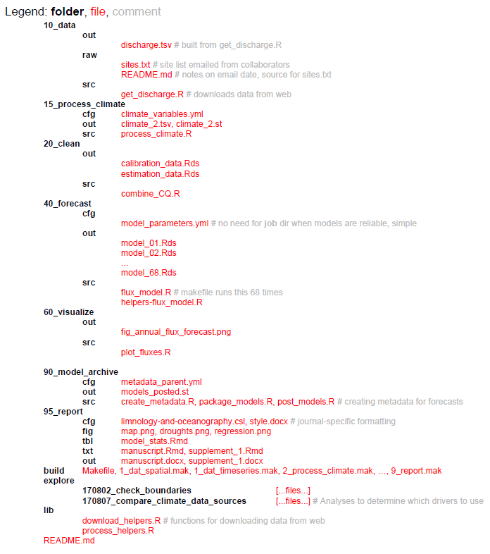
Organized project structures help the scientist and collaborators navigate the workflow of the ecological forecasting project from data input to dissemination of results. Subfolders should be used to break up the project into conceptually distinct steps of the forecasts and sequentially numbering of scripts and subfolders helps with readability, for example, “10_data”, “20_clean”, “40_forecast”, “60_visualize”, “95_report” (see more detailed example below). The number prefixes should represent a conceptual workflow for each forecasting project, and subdirectories within each phase of the project should describe the inputs, outputs, and functions for each step. Generally, unnumbered directories should contain supporting files that apply to the overall project, for example a configuration file that is used in multiple phases of the forecasting project.
Example of organized folder and file structure for a forecasting project.
Tools for organized project structures
Project-oriented workflows are self-contained workflows enabling reproducibility and navigability when used in conjunction with organized project structures for ecological forecasting projects. Ideally, a collaborator should be able to run the entire project without changing any code or files (e.g. file paths should be workstation-independent). R and Python both have options for enabling self-contained workflows in their coding environments.
R – RStudio projects – R projects allow for analyses to be contained in a single working directory that can be given to a collaborator and run without changing file directory paths.
Python – Spyder projects – Python projects also allow for self-contained analyses and integration with Git version control (see Version Control below).
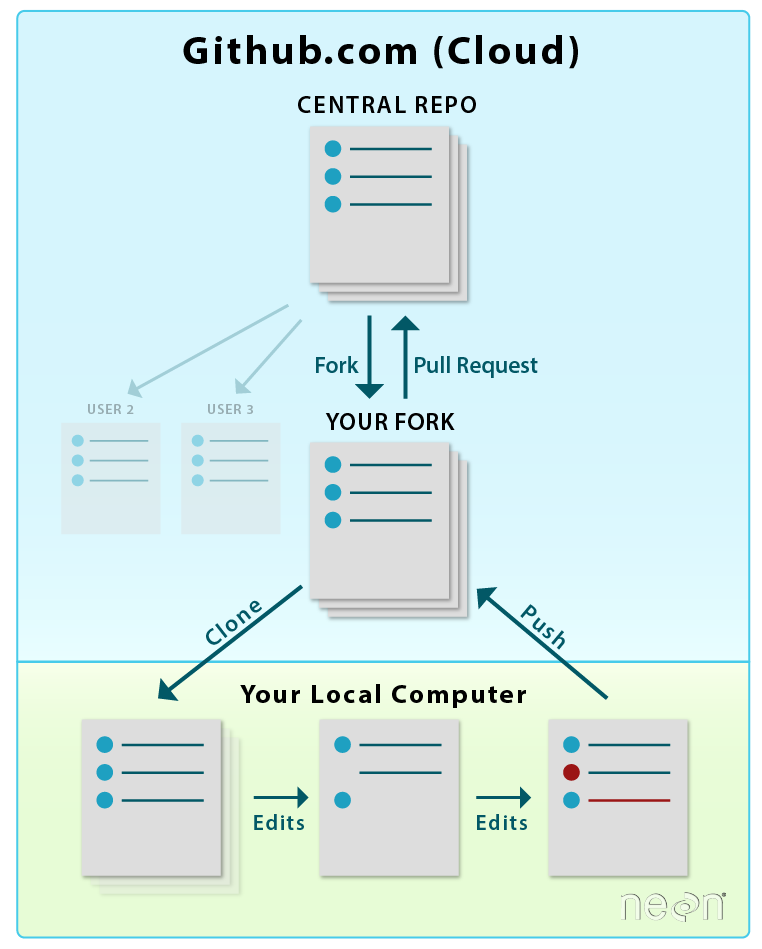
Version control is the process of managing changes in code and workflows and improves transparency in the code development process and facilitates open science and reproducibility. Code versioning also enables experimentation and development of code on different “branches” while retaining canonical files that can be used in operations, for example. Modern version control systems make it easy to create and switch between branches within a code base, encouraging developers to experiment without potentially breaking changes without worrying about losing stable code. This is especially useful for forecasting projects that need to make forecasts at regular schedules (e.g. daily), while researchers can also make alterations to the code base on experimental branches. Finally, version control facilitates collaboration by formalizing the process for introducing changes and keeping a record of who introduced which changes, when, and why. Additionally, version control allows contributions in an open way from even unknown contributors with the opportunity for the main authors control which contributions are accepted. Software development is a trillion dollar industry and it is well worth the time learning the basics of industry standard tools like version control, rather than relying on ad hoc and error prone approaches such as file naming (e.g. script.v2.R, python_script_final_FINAL.py), Dropbox/Google Drive, or emailing files to collaborators.
Tools for version control
The distributed model of version control is where developers of code work from local repositories which are linked to a central repository. This enables automatic branching and merging, improves the ability to work offline, and doesn’t rely on a single repository for backup.
Git is the most popular open-source version control system among ecologists and also professional software developers. The popularity enables contributions from many collaborators since potential contributors will likely be used to using Git and web interfaces like GitHub.
You can practice using Git for version control with some simple tutorials.
GitLab also uses Git, and similar to GitHub allows for issue tracking and various other project management tools, and GitLab provides more options for collaborator authentication.
Example of version control workflow using Git. Figure from here.
Traditionally, scientific writing and coding are separate activities—for example, a researcher who wants to use code to generate a figure for her paper will have the code for generating that figure in one file and the document itself in another. This is a challenge for reproducibility and provenance tracking because both criteria have to be maintained for multiple files simultaneously. “Literate programming” provides an alternative approach, whereby code and text are interleaved within a single file; these files can be processed by special literate programming software to produce documents with the output of the code (e.g. figures, tables, and summary statistics) automatically interspersed with the document’s body text. This approach has several advantages. For one, the code output of a literate programming document is by definition guaranteed to be consistent with the code in the document’s source. At the same time, literate programming can make it easier to develop analyses by reducing the separation between writing and coding; for instance, interactive literate programming software can be used to keep “digital lab notebooks” where analyses are developed and described in the same file. In the context of ecological forecasting, literate programming techniques can be particularly useful for writing forecast software documentation, and can even be used for creating automatically-updating documents and reports describing forecast output.
Tools for literate programming
Two effective and common tools for literate programming are:
R Markdown — Allows code from multiple different languages including R, Python, SQL, C, and sh to be embedded within a common markup language (Markdown). Multiple different languages can be embedded within different blocks in the same document. Documents can be exported to a wide range of formats, including PDF, HTML, and DOCX. By default, R Markdown documents are static (i.e. the entire document is rendered all at once with a command); however, recent versions of RStudio allow them to be used interactively by rendering specific code blocks directly in the code editor window. R Markdown documents compiled to HTML format can easily embed interactive elements ranging from clickable plots and subsettable tables (e.g. htmlwidgets) to full applications with user-defined inputs (via RShiny); for more information, stay tuned for our follow up task view on Visualization.
Jupyter — Unlike R Markdown, these were designed from the start to be used interactively. Documents are stored in a format that makes them difficult to edit with a plain-text editor; rather, they are typically edited using a special browser-based editor that runs a language “kernel” in the background. The results of any particular code block are stored across sessions, so code blocks do not need to be re-evaluated when exporting to other formats. A document can only use a single language, with Julia, Python, and R supported.
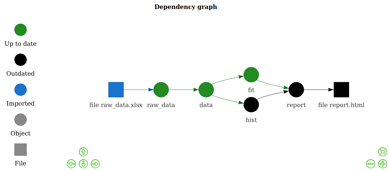
Workflows are typically high-level descriptions of sets of tasks to be performed as part of an overall scientific application, at least in the context of this blog. There are a wide variety of methods and formats for expressing such descriptions. Workflows must include information about the tasks themselves, as well as their inputs and outputs, which either implicitly define or explicitly state dependencies among the tasks. This information, including the dependencies, is used by a Workflow Management System (WMS) to execute the tasks, potentially 1) on a local computer or one or more remote computers, including clouds and HPC or HTC systems; 2) serially or in parallel; 3) from the start or from a previous partially complete state. These dependencies can be static (fully defined before the application is run) or dynamic (e.g. partially defined based on data, execution, or other resources).
Workflow management systems help efficiently reproduce portions of or entire scientific workflows. These tools analyze workflows, skip phases of the workflow that are up-to-date (if the exact inputs and tasks have been run previously, the previous outputs can be returned; this technique is sometimes called memoization), and execute tasks that are out-of-date, tasks downstream of out-of-date tasks, or tasks required to execute based on scheduled run times (e.g., daily-updating forecast). These tools are especially useful for large projects that bring multiple streams of data together in an analysis since it relieves the analyst from duties of keeping track of workflow order and tasks that need to be rerun. For example, when new data about a model parameter is included in the forecasting workflow, only the portion of the workflow dependent on that new data will be executed.
Example of a simple dependency graph and which tasks will be executed using a workflow management system (from Drake workflow example).
Below we list a few tools for workflows and dependency management. There are however many other workflow and dependency management tools. A larger list can be found here.
Drake is an R-based ‘make’ like toolkit that tracks dependencies among phases of your workflow and executes work that is out-of-date. Drake builds upon previous R dependency managers such as remake, and can deal with high-performance or -throughput computing (HPC / HTC) within the WMS framework. This includes automated detection and retries for model failures, and launching Slurm (or other job schedulers for HTC) jobs directly from a drake plan.
Snakemake is a Python-based workflow management tool that includes a lot of the same functionality as Drake for R, including being compatible with HPC / HTC or cloud computing environments. The rules defined in a Snakemake target can use shell or Python commands or run external Python or R scripts, as well as utilize various remote storage environments such as Amazon S3, Dropbox, or Google Storage.
Parsl is a Python library that lets users define a workflow through a Python program, or parallelize a Python program. They do this by ‘decorating’ the definition of Python functions and calls to external applications to indicate that they are potentially parallelizable and asynchronous tasks. When such a task is called, Parsl intercepts it and adds it to an internal dynamic directed acyclic graph that captures the overall application dependencies. If both the inputs for the task and execution resources are available, the task is run, and if not, it waits until these conditions are satisfied. In either case, Parsl immediately returns a ‘future’, a placeholder for the eventual return value, so that the overall application can proceed, which allows multiple tasks to run in parallel. Parsl is an open source project led by U Chicago & Illinois, which supports a wide variety of execution resources (e.g., local, CPUs, GPUs, HPC, HTC, cloud) and schedulers.
Pegasus is another scientific workflow system with a long history of development and use in the science world (e.g., it’s the workflow system used by LIGO)
Argo is a more recent kubernetes-based workflow system, convenient when much of the workflow is within docker already (see Containerization below).
Airflow is another workflow system, developed and used by AirBnB and others, mostly in industry. Airflow is now a project within the Apache Software Foundation. It allows a user to author workflows as Directed Acyclic Graphs (DAGs) of tasks. The Airflow scheduler executes the tasks on an array of workers while following the specified dependencies. It also has a user interface to allow the user to visualize pipelines running in production, monitor progress, and troubleshoot issues.
Ecological forecasting workflows can be complex and involve many steps from data ingest, data cleaning, producing forecasts, to visualizing output. Often, these forecasting workflows need to produce output on a regular schedule and ensuring that each part of the workflow performs appropriately is crucial for making forecasts and identifying failure points, whether operational or not. Unit testing is automated tests on small units within a larger workflow to ensure that the different sections behave as intended (e.g. testing that individual functions return the expected outputs for valid inputs and the expected errors for invalid inputs). Frequently unit tests are also used for regression testing, where a test is created for a previous bug or problem that is fixed. The regression test is used to prevent a bug from being reintroduced. In combination with continuous integration (see below), these tests ensure that modifications to a code base run as expected after the modifications have been integrated.
In case of complex workflows or systems, a unit test will only test to make sure each of the components are working as intended. Additionally an integration or system test will need to be performed at certain points to test all the components interacting with each other. For example does each component still produce the outputs expected by the next steps in the workflow.
Tools for unit testing
Most programming languages have a testing framework that will help with the unit tests. A list of tools here, some of the commonly used testing frameworks for tools used in forecasting are:
testthat for R, including examples of how to implement unit testing in R.
Both the models we use to make predictions and the forecasting workflows we build around them are, in some sense, always a work in progress. Any time we make changes to our models and workflows, whether it’s updating a library or adding a data source, there’s a chance that we’ll break our workflow. Tools for continuous integration enable researchers to update their forecasts and run tests on their code in an automated and robust manner (e.g. with system tests in place to check for accidental deployments that would otherwise break a deployment). Continuous Integration (CI) tools automatically builds and deploys software ecosystems, and tests new versions of code to ensure development of models will work. This is especially important for iterative forecasts that need to be deployed at regular intervals (e.g. daily forecasts). As CI tools continue to become more powerful, flexible, and generous with their service offerings, they can expand from supporting development workflows to even be used as the primary platforms for application workflows, such as iterative, real-time forecasting. Below we list few of these tools and a larger list can be found here or here:
Travis CI, Probably the most popular automated testing tool on GitHub, at least in the recent past. This service is designed to test builds and run unit tests (and other, short-lived scripts) on a variety of different virtual platforms with different configurations. Travic CI runs for free on its Travis CI servers, but has time and CPU limits (at least for the free version (though a user can request that these limits be increased). Some features include the ability to run actions in parallel (configured via a YAML file) and an ability to be accessed via an API.
GitHub Actions, similar to Travis CI, but hosted natively by GitHub and with more generous time, memory, and CPU allowances for open-source (public) projects on GitHub. GitHub Actions is quickly increasing in popularity.
GitLab CI, similar to Travis and GitHub Actions but hosted by GitLab.
Complex scientific workflows often involve combining multiple different tools written in different programming languages and/or possessing different software dependencies. Even a simple R script may depend on multiple R packages, and may only work as expected if specific versions of those packages are used. Managing these different tools and their dependencies can be a complex task, especially when tools conflict with each other (e.g. one tool may only work with an older version of a library, while another tool may only work with a newer version of the same library). As the number of tools and their dependencies in a workflow grows, managing these dependencies becomes challenging, and reproducing this workflow on a different machine (potentially with a different operating system) is even more challenging. Containers resolve these issues by providing a way to create isolated packages for each software element and its dependencies. These containers can then run on any computing environment (as long as it has the requisite container software itself installed). Moreover, containerization software sometimes allows for the creation of container stacks (a.k.a “orchestration”)— collections of multiple containers that communicate with each other (including sharing data) and with the host system in precise, user-defined ways (see Workflow and Dependency Management above). In some cases, these container stacks can be deployed across multiple physical or virtual computers, which greatly facilitates the process of scaling computationally intensive analyses.
Tools for containerization
By far the most common tool for containerization — indeed, the emerging standard across the software development industry — is Docker. Docker containers are typically created from a definition file, basically just a starting container (e.g. a specific version of a Linux operating system) followed by a list of shell commands describing the installation and configuration of the specified software and its dependencies. Thousands of existing containers (any of which can be used as a starting point for a custom container) for a wide range of software are available on Docker Hub, a publicly available registry. Software stacks and workflows using multiple containers can be created via Docker Compose, which automatically configures and runs multiple interrelated Docker containers from a human-readable (YAML) specification file. Several tools for orchestration of Docker containers exist — Docker Swarm is distributed as part of Docker (i.e. no additional installation) and allows for rapid deployment with minimal configuration, while Kubernetes is a much more complex but feature-rich solution. Another quickly maturing tool leveraging Docker is The Binder Project, which is a relatively easy to use tool that turns a Git repository into a Docker image for deploying a reproducible computing environment in the cloud.
Unfortunately, Docker’s design precludes its use on high-performance computing clusters and other enterprise-managed machines often encountered in the sciences. In particular, running Docker containers requires running a persistent background process with administrative (“root”) privileges on the host machine. This is not an issue on self-managed, isolated physical (e.g. your personal laptop) and virtual (e.g. Amazon Web Services) machines. However, it does pose a major security concern that precludes its use on high-performance computing clusters and other enterprise-managed machines often encountered in the sciences. Singularity is an alternative that was designed specifically to address these concerns. Unlike Docker, Singularity does not require a persistent background process to run — rather, its design involves creating containers that are fully self-contained executable files. These files can then be distributed just like any other files, and executed on any machine (as long as that machine has a compatible version of Singularity installed). The initial install of Singularity, as well as the creation of containers, does require root permissions, but unlike Docker, the containers themselves run as a single process with only user permissions. Besides the security implications, this design also makes Singularity containers more amenable to HPC queue submission systems (running the containers is effectively the same as running any other executable). Like Docker, Singularity containers can be created via a definition file, and can be stored on a free, publicly available registry (Singularity Hub). The major downside of Singularity is that it has a much smaller user base (largely limited to a small subset of the scientific community, compared to Docker’s widespread use in both science and industry), and is much less mature software. For example, while Singularity does provide a “Compose” interface, as of this writing this is still in early development and highly experimental. Singularity also works with Kubernetes.
Metadata provide crucial information on the ecological forecasting data, including model input, output, and parameters, among others. Metadata tells the user how to interpret model output and what conditions are needed to reproduce output. Metadata is also used to describe the size and dimensions of the dataset, quality of the data, author of the data, keywords of the project used to produce the data, and details on how the data were produced. Appropriately documenting ecological forecasting output helps other researchers find relevant datasets and reuse output for other applications such as input to other models, or cross-model comparison such as a forecasting challenge.
Tools for metadata
Ecological Metadata Language (EML) is a community-maintained project for documenting research data with a readable XML markup syntax. EML serves the needs of the research community and is modularly designed to enable growth in the language as the needs of the earth and environmental sciences evolve. The Ecological Forecasting Initiative has developed additional forecast-specific standards using EML as the base metadata standards. The EML R package facilitates generating an EML document, however, these documents can also be created using a text editor or other scripting languages such as Python.
EFI is in the process of drafting an ecological forecasting metadata standard that extends EML. Current info is located in our forecast-standards repo
A core principle of creating reproducible scientific workflows is making the code and data used in the analyses available to the public through data and code publication or releases. It is now often required by journals or institutions to publish the data used in scientific publications and to a lesser extent, the code used in the analyses. Many of the other reproducible principles described above enable efficient data and code release and publication. For example, remote version control repositories, such as GitHub, display developmental and stable code bases and can tag versions of code to be released along with details on what the version was used for (e.g. “v1.2.1 used in analyses described by Dasari et al. 2019”). These code releases can also become citable with digital object identifier (DOI) by connecting with other archiving tools. Data releases should also be relatively painless if the previous principles of reproducible workflows are followed. Key to data releases and publishing in repositories are descriptive metadata that describe important characteristics of the dataset that is to be published (see Metadata section above). Additionally, embedding data publishing tasks (e.g. metadata descriptions, pushing data to a remote repository) in a dependency management system (see above) can make updating data in a public repository as easy as executing one line of code.
Tools for data and code release
Zenodo – a general purpose open-access repository, often used with GitHub to publish software.
DataOne – a repository for environmental and ecological data.
Dryad – a general purpose repository for research data.