Ecological forecasting is going to transform our understanding of ecology. I am thrilled to have the opportunity to help coordinate efforts to improve and move the field forward.
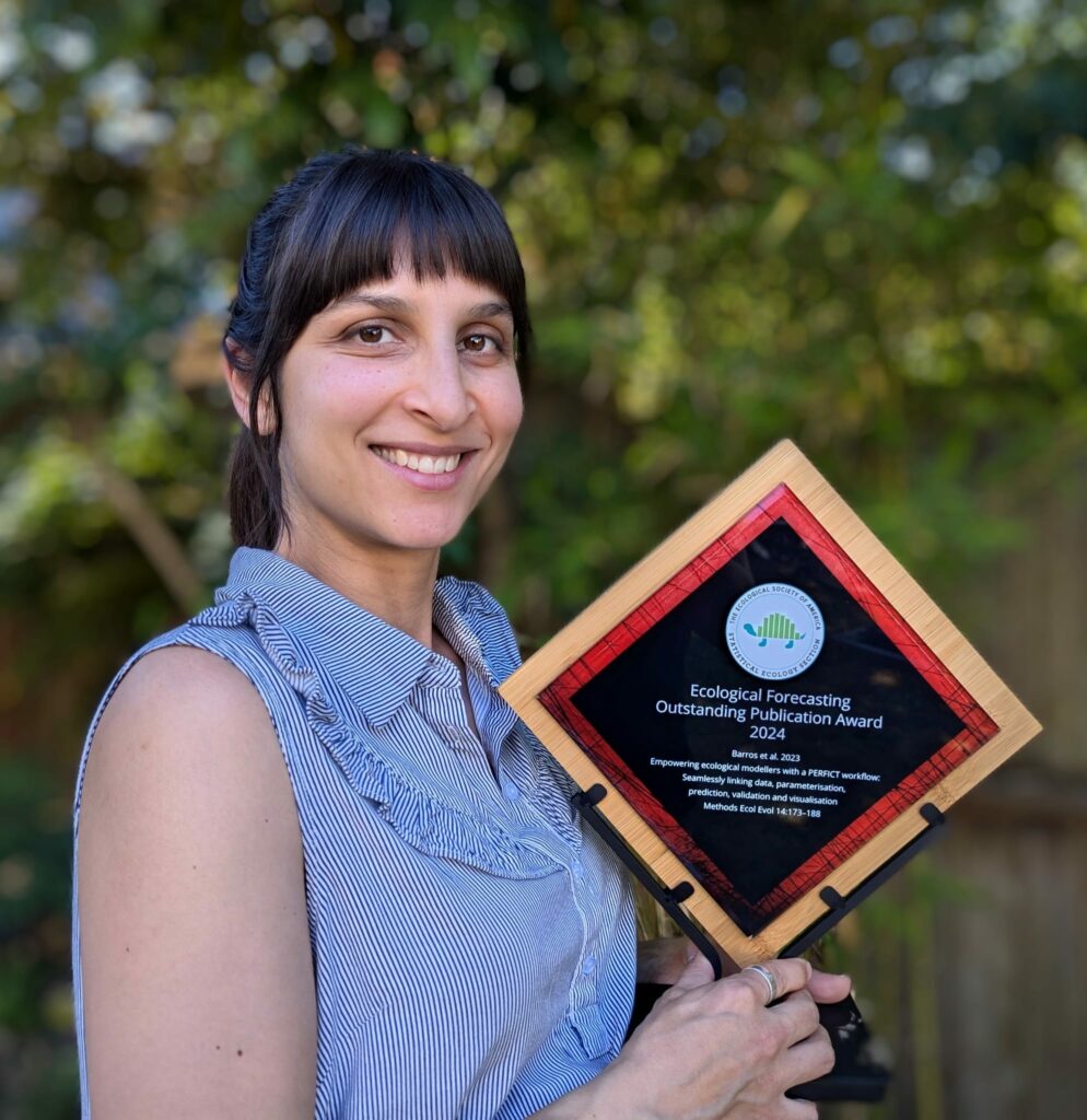
The ESA Statistical Ecology section presented the 2024 Ecological Forecasting Outstanding Publication Award to Cerres Barrosand co-authors, Yong Luo, Alex Chubaty, Ian Eddy, Tatiane Micheletti, Céline Boisvenue, David Andison, Steven Cumming, & Eliot McIntire, for their 2023 Methods in Ecology and Evolution paper:
The award committee was strongly impressed by the way this paper clearly organized and presented cyberinfrastructure principles that are an increasingly important part of doing ecology well. This paper helps to translate software engineering concepts into clear take home messages that are accessible to ecologists (e.g., predictions depend on workflows, not just models) and draws attention to the need for Interdisciplinary teamwork in successful ecological forecasting. The committee was further impressed by this team’s commitment to developing tools that are accessible, reusable, and multi-purpose, and that address the challenges of operationalizing ecological forecasts.
In addition to an award plaque and prize ($200), this year’s recipient will also receive a £120 credit from Routledge books.
2024 – Cerres Barros (University of British Columbia) Barros, C., Luo, Y., Chubaty, A. M., Eddy, I. M. S., Micheletti, T., Boisvenue, C., Andison, D. W., Cumming, S. G., & McIntire, E. J. B. (2023). Empowering ecological modellers with a PERFICT workflow: Seamlessly linking data, parameterisation, prediction, validation and visualisation. Methods in Ecology and Evolution, 14, 173–188. https://doi.org/10.1111/2041-210X.14034
2023 – Jacob Zwart (USGS) Zwart, J.A., Oliver, S.K., Watkins, W.D., Sadler, J.M., Appling, A.P., Corson-Dosch, H.R., Jia, X., Kumar, V., and Read, J.S. 2023. “Near-Term Forecasts of Stream Temperature Using Deep Learning and Data Assimilation in Support of Management Decisions.” JAWRA Journal of the American Water Resources Association 59 (2): 317–37. https://doi.org/10.1111/1752-1688.13093.
2022 – Kelly Heilman (University of Arizona) Heilman, K.A., Dietze, M.C., Arizpe, A.A., Aragon, J., Gray, A., Shaw, J.D., Finley, A.O., Klesse, S., DeRose, R.J., & Evans, M.E.K. (2022). Ecological forecasting of tree growth: Regional fusion of tree-ring and forest inventory data to quantify drivers and characterize uncertainty. Global Change Biology 28(7):2442-2460 doi.org/10.1111/gcb.16038
2021 – Sarah Saunders (National Audubon Society) Saunders, S.P., F.J. Cuthbert, and E.F. Zipkin. “Evaluating Population Viability and Efficacy of Conservation Management Using Integrated Population Models.” Journal of Applied Ecology 55, no. 3 (2018): 1380–92. https://doi.org/10.1111/1365-2664.13080.
2020 – Paige Howell (USGS) Howell, P.E., B.R. Hossack, E. Muths, B.H. Sigafus, A. Chenevert‐Steffler, and R.B. Chandler. “A Statistical Forecasting Approach to Metapopulation Viability Analysis.” Ecological Applications 30, no. 2 (2020): e02038. https://doi.org/10.1002/eap.2038.
2019 – Maria Paniw (CREAF, Ecological and Forestry Applications Research Centre) Paniw, M., N. Maag, G. Cozzi, T. Clutton-Brock, and A. Ozgul. “Life History Responses of Meerkats to Seasonal Changes in Extreme Environments.” Science 363, no. 6427 (February 8, 2019): 631–35. https://doi.org/10.1126/science.aau5905.
2018 – Quinn Thomas (Virginia Tech) Thomas, R.Q., E.B. Brooks, A.L. Jersild, E.J. Ward, R.H. Wynne, T.J. Albaugh, H. Dinon-Aldridge, et al. “Leveraging 35 Years of Pinus Taeda Research in the Southeastern US to Constrain Forest Carbon Cycle Predictions: Regional Data Assimilation Using Ecosystem Experiments.” Biogeosciences 14, no. 14 (2017): 3525–47. https://doi.org/10.5194/bg-14-3525-2017.
EFI is excited about the opportunity to connect with the broader community through a number of events at ESA in Long Beach, California this year! Below are details about the EFI Social, a workshop about the NEON Forecasting Challenge, multiple sessions organized by EFI and others about forecasting EFI-organized and other forecasting, and a Career Central panel. If you are presenting an ecological forecasting-related talk or poster that you don’t see on the list, reach out so we can get it added to this list!
We will again have EFI badges to add to your name tags! We will continue to make updates to this page prior to ESA. All times listed below are in US Pacific Time.
EFI Badges
We will have EFI badges that can be attached to the ESA name tags available for individuals who are part of the Ecological Forecasting Initiative community. Find Mike Dietze throughout the week or at the EFI Social on Wednesday to get a badge and look for others with the green badge!
EFI Social Wednesday, August 7 at 6:30-8:30 PM
Connect and network with others in the EFI community over food, including vegan and vegetarian options at The Auld Dubliner. The Auld Dubliner is just 400 feet from the Convention Center.
This workshop will provide an overview of the EFI RCN NEON Ecological Forecasting Challenge theme forecasting ground beetle abundance and richness across NEON terrestrial sites. The workshop will include code-along instructions to help participants create and submit a simple forecast to the Forecasting Challenge platform as well as interpret metrics of forecast skill. Participants will gain a foundation that can be built upon to create more sophisticated predictions about ecological communities and use the EFI RCN resources in future forecasting applications.
This session, organized by Charlotte Malmborg (Boston University) and R. Alex Thompson (Washington State University), has been in the works since ESA 2023 with conversations about the then-blog post, now-published paper about model complexity (https://doi.org/10.1002/met.2202). There will be an audience discussion following the panelists and it would be great to have fellow forecasters join that discussion.
Extreme weather events, including heat waves, droughts, flooding, and unusual cold periods, are a major component of global climate change. Despite increases in the frequency and magnitude of extreme weather events, direct and indirect effects on biodiversity, phenology, and ecosystem services remain poorly understood. Assessing and anticipating impacts of extreme weather presents unique obstacles across systems, geographies, and scales. Key challenges include availability of and accessibility to relevant data resources, development of methods and approaches to characterize extreme weather events, and obstacles to predicting and forecasting. Solutions require multidisciplinary collaborations across the ecological community to develop effective tools and resources to address these challenges. We propose a session to convene a panel of experts spanning multiple career stages in the fields of biodiversity informatics, plant and insect phenology, and vector borne disease systems to discuss key challenges to understanding and anticipating extreme weather effects across organisms, phenology, and ecosystems. Session hosts will provide a talk outlining work within their field of expertise, followed by an interactive panel and audience discussion. The session will culminate in a dedicated 10-minute discussion, facilitated by the organizer, focusing on facilitating cross-disciplinary collaborations to leverage knowledge and approaches applicable to addressing challenges across domains.
Speakers: Robert Guralnick (University of Florida), Michael Belitz (Michigan State University), Daijiang Li (Louisiana State University), Assaf Anyamba (Oak Ridge National Laboratory)
Join this insightful session with founders of ecological organizations, consulting services, and innovative initiatives. Panelists are entrepreneurs who have demonstrated initiative, leadership, and innovation in creating and leading their communities of practice. If you identify with these qualities, you too can become an entrepreneur.
Panelists: Tim Nuttle (Oikos Ecology), Michael Dietze (Ecological Forecasting initiative), Shah Selbe (Conservify and FieldKit)
The EFI2024 Conference provided the second opportunity for EFI to give out the EFI Futures Outstanding Student Presentation Award. This award is given to promote, recognize, and reward an outstanding student presenter and provides valuable feedback to student presenters on their research and presentation skills. Awards were given to students who gave both Posters and Oral Presentations. Poster or oral presentations were anonymously reviewed by three volunteer reviewers with no conflicts of interest with the presenters. In addition to being recognized for their outstanding work, award winners get to select any item from the EFI shop. We thank all the students who presented and the volunteers who reviewed the presentations!
Congratulations to this year’s Outstanding Presentation Award recipients!
Gabrielle Koerich (University of Canterbury) won for her oral presentation, “Modelling bryophyte distributions in Antarctica: unveiling the influence of water availability, sampling bias, and spatially complex dynamics” and
Nima Farchadi (San Diego State University) won for his poster “Integrating diverse data for robust species distribution models in a dynamic ocean.”
See Gabrielle and Nima’s presentation details below.
Modelling bryophyte distributions in Antarctica: unveiling the influence of water availability, sampling bias, and spatially complex dynamics
Gabrielle Koerich1 , Hao Ran Lai1 , Grant Duffy2 , Eva B. Nielsen1 , Jonathan D. Tonkin1 1University of Canterbury, Christchurch, New Zealand. 2University of Otago, Dunedin, New Zealand
Abstract: In Antarctica, observations of biodiversity are often incomplete and commonly restricted to presence-only data, as sampling in the continent is difficult. Thus, understanding and forecasting the range dynamics of key taxa, such as bryophytes, requires a modelling framework capable of dealing with such challenges. Here, we developed log-Gaussian Cox process models of bryophytes’ across the entire Antarctic continent to (1) assess whether broad-scale bryophytes distributions are driven by water availability, as widely hypothesized; (2) map and forecast their distributions and identify under sampled regions; and (3) determine if there’s a spatial dependency between “patches” of bryophytes, which may be related to their limited dispersal in Antarctica. Results show that the main driver of bryophytes distributions in Antarctica is indeed related to areas where water tends to accumulate (97.5% CI:-0.886;-0.797). Maximum temperature was the second most important predictor (97.5% CI: 0.511; 0.681), signalling the importance of elevated temperatures for bryophytes’ restricted metabolism in this extreme environment. The covariate related to human activity showed a high level of sampling bias, and by accounting for this covariate in predictions, we detected habitat suitability for bryophytes in two under-sampled mountain ranges. Finally, the inclusion of a Gaussian random field to account for spatial autocorrelation increased model performance (pseudo R2 and mapped mean estimated density), indicating a spatial dependency between the presence of mosses. Our study demonstrates that a spatially structured modelling framework can provide robust results and allow for valuable forecasts of biodiversity change in data-poor regions.
Integrating diverse data for robust species distribution models in a dynamic ocean
Nima Farchadi1 , Camrin Braun2 , Martin Arostegui2 , Rebecca Lewison1 1San Diego State University, San Diego, USA. 2Woods Hole Oceanographic Institution, Woods Hole, USA
Abstract: Species distribution models (SDMs) are an important tool for marine conservation and management. Despite the burgeoning use of SDMs, limited guidance is available on how to leverage distinct data types to build robust models. Here we assess whether an integrative model framework improves performance over traditional data pooling or ensemble approaches when synthesizing multiple data types. We trained traditional, correlative SDMs and integrative SDMs (iSDMs) with three distinct data types that represent the distribution of a heavily exploited pelagic fish, the blue shark (Prionace glauca), in the North Atlantic. Weevaluated data pooling and ensembling approaches in a correlative SDM framework and compared performance to a model-based data integration approach designed to explicitly account for data-specific biases while retaining the strengths of each dataset. We found that while each integration approach can result in robust models, there was variation in predictive accuracy among data types, with all models predicting fishery-dependent data more accurately than fishery-independent data. Differences in performance were primarily attributed to each model’s ability to explain the spatiotemporal dynamics of the training data, with iSDMs including spatiotemporal terms to have the most accurate and ecological realistic estimates. Our findings reveal trade-offs in the current techniques for integrating data in SDMs between accurately estimating species distributions, generating ecologically realistic predictions, and practical feasibility. With increasing access to growing and diverse data sources, comparing integration approaches can provide valuable guidance for practitioners navigating diverse data types in SDM development and will help users better understand model biases and estimate error.
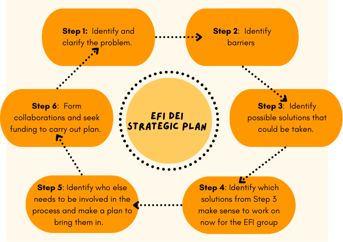
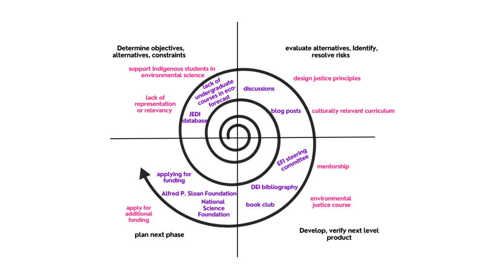
The Diversity, Equity, and Inclusion (DEI, see point 1 below) working group was created because EFI recognizes that we need involvement and collaboration with underrepresented groups to equitably meet the needs of diverse communities who are using and impacted by ecological forecasts. To this end, the EFI DEI working group, led by input from Diana Dalbotten (University of Minnesota) began in October 2019 to develop an EFI DEI Working Group Strategic Plan (Figure 1) with steps to broaden participation in EFI. At the time, the focus had mainly been on broadening racial diversity based on racial categories common within the United States. Yet other metrics of diversity (gender, nationality, career stage, academic discipline, occupation sector) are also important to EFI. By May 2020, the group posted the Strategic Plan on the EFI DEI working group page to publicly share the plan and use it as official guidance for group activities.
Four years later, the DEI working group is revisiting the plan to remind ourselves of our activities and place them within the context of the Strategic Plan. Our goal is to consider which activities the group sees as successful and where there continue to be opportunities for growth.
Point 1Although the working group name uses the acronym DEI, we recognize that Justice is an integral part of DEI work. We therefore refer to the EFI Working Group as DEI and the activities of the group as DEIJ.
Figure 1 . Steps in the original DEI Strategic Plan
The original DEI Strategic Plan highlighted that, just as the iterative approach is useful for ecological forecasting, likewise it is beneficial for the process of engaging with people from underrepresented backgrounds. However, during our reecnt review process, the DEI Strategic Plan instead appeared as a fairly linear process, which in practice, it has not been. Instead, the group has worked on projects across all six steps as opportunities have become available or aligned with ongoing work.
The working group is planning to revise the original Strategic Plan. To this end, the group envisions adding Diversity, Equity, Inclusion, and Justice (DEIJ) perspectives and actions into EFI activities as a spiral rather than a circle (Figure 2). The group will continue to refine the iterative nature of EFI’s DEIJ efforts and will share details about that in the future. For this blog, however, our goal is to compile a record of what has been done to acknowledge past efforts and inspire and inform future efforts. Future steps will assess what has been successful, examine whether or not we have the metrics to measure success, and reflect on challenges that we can learn from to improve the iterative process in future efforts.
Figure 2. A potential new way to think of the EFI Strategic Plan
Strategic Plan Steps
Below we list the six steps of the Strategic Plan and the DEI working group activities for each step.
Step 1: Identify and clarify the problem.
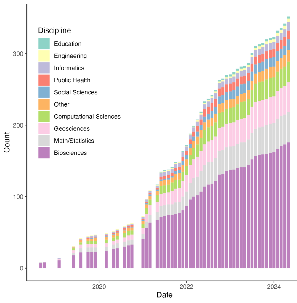
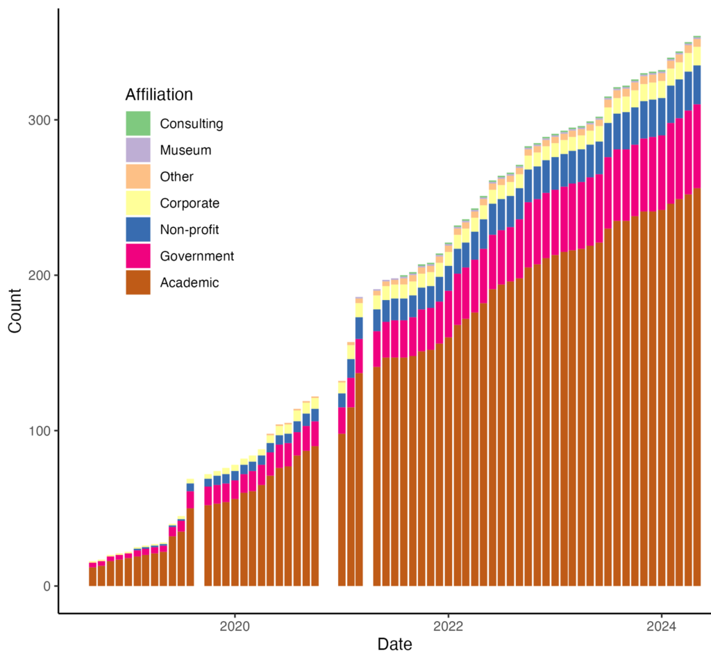
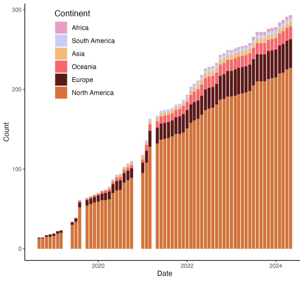
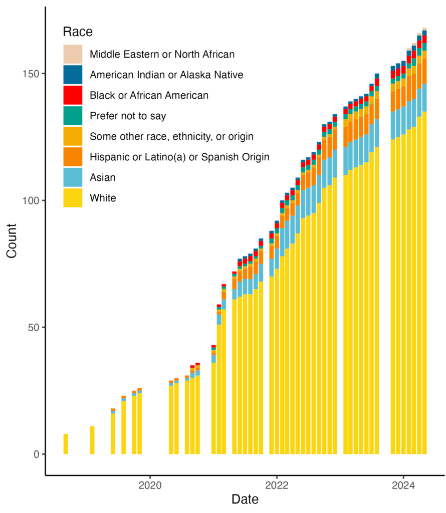
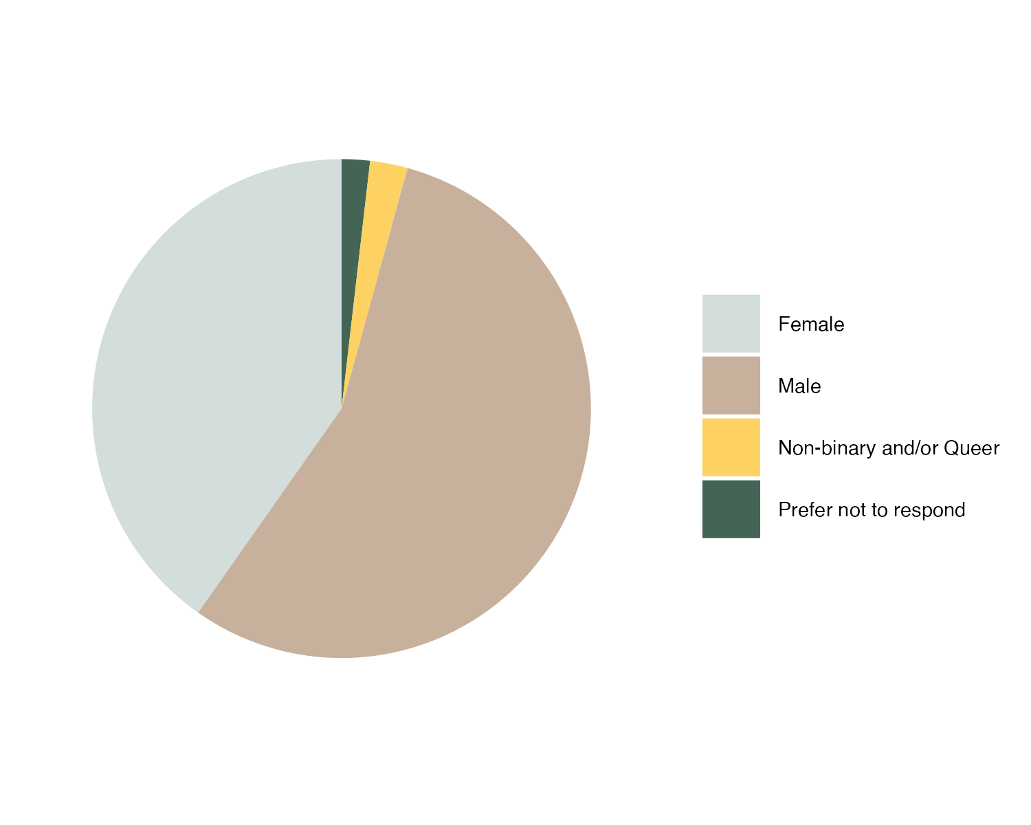
JEDI Database – Dave Klinges (University of Florida) and Jody Peters (University of Notre Dame) have collaborated to develop a workflow to take anonymized EFI membership information and create plots of diversity metrics (see Figures 3-7 below) to assess how the community has changed through time, relative to external baselines.
Publication: Willson et al 2023. Assessing opportunities and inequities in undergraduate ecological forecasting education. Ecology and Evolution 13(5): e10001.
Willson et al. compiled resources for teaching and learning ecological forecasting at different curriculum levels and identified gaps between ecological forecasting courses offered at doctoral universities, in comparison to other colleges and universities. The authors also noted a general lack of high-level, quantitative forecasting opportunities for undergraduates.
Step 2: Identify barriers that may be preventing students from underrepresented groups to participate in ecological forecasting as a career.
Sean Dorr (University of Minnesota) has led and fostered discussions, workshops, and focus groups for multiple EFI activities about the Design Justice Principles as they relate to the Forecasting Challenge and forecasting cyberinfrastructure
DEI Book Clubs have met since 2020 to provide opportunities for the EFI community to learn about different topics of racism, diversity, inclusion, and justice through small group discussions
Step 3: Identify possible solutions that could be taken.
The DEI working group meets monthly, and conversations include identifying solutions for barriers identified in Step 2 and then working on solutions in Step 4. Meeting notes from the monthly calls can be found at the bottom of the DEI webpage.
DEI Book Club suggestions and action items
In October 2023, the DEI Working Group created this living document to provide a summary of action items suggested during book club calls. The living document is to be used as a reference to support and inspire activities for EFI that can be developed and led as individuals have time, availability, and interest in doing so. The living document also provides an opportunity to collate and celebrate activities that have taken place that have been inspired by or align with suggestions from the book clubs.
Based on Willson et al 2023, the group identified curriculum development at minority serving institutions as a solution to address the lack of ecological forecasting in course work and a path to introduce more Native American students to ecological forecasting topics.
Step 4: Identify which solutions from Step 3 make sense to work on now for the EFI group.
The Bibliography is a living document that provides resources for learning more about anti-racism and the diversity status of fields relevant to ecological forecasting. These resources include lists of minority supporting associations, links to diversity and inclusion plans from professional societies, blog posts, publications, and compiled lists of resources from other organizations. Additional resources shared through the working group are continually added. If you are aware of additional resources to include, please submit them to this Google form.
The Bibliography resources are also included in the EFI Zotero library and tagged as “EFI DEI Paper” papers
The EFI Steering Committee is dedicated to always having one or more people with experience addressing DEIJ issues on the committee, and increasing diversity, equity, and inclusion is one of the five high level objectives of EFI’s Strategic Plan.
4-part virtual seminar series titled “Conversations on Diversity and Data Seminar Series” – foster conversations, brainstorm actions, and make community connections that help promote diversity within ecological forecasting. Recordings and resources from these panel conversations are available in the links below.
The book club group that read Braiding Sweetgrass by Robin Wall Kimmerer developed a gratitude statement regarding data as a gift from the community. You can find the statement on the DEI webpage and the Book Club webpage.
The Braiding Sweetgrass book club included student participants from the Sustainable Land and Water Resources (SLAWR) REU, which provided opportunities for discussions across career stages and sectors
Job posts and funding opportunities are listed on EFI’s Slack group and in the newsletters to increase visibility to the EFI community
Step 5: Identify who else needs to be involved in the process and make a plan to bring them in.
Note that this step might actually be better as Step 1–what groups should be involved in identifying the problem? If the problem is that the right people are not involved, how can we adequately examine the barriers and identify solutions? We realize we cannot solve the problem without broader participation in identifying the issues, barriers, and potential strategies.
Building relationships is a critical part of this step, and relationship building takes time and trust. Diana Dalbotten (University of Minnesota) has been largely influential in helping to set up collaborations with individuals at minority serving and Tribal institutions. These partnerships produced funding success from the Alfred P. Sloan Foundation and funding applications submitted to the National Science Foundation. As these relationships continue to develop, they inform actions to prioritize and relationship building efforts.
Identifying collaborators and building relationships can happen at any point in the process, but they are included as a step here to acknowledge that, as more work is done, it will inform which partners are still missing. We can then be intentional about bringing in more people to fill these gaps. In recognizing that this step links back to Step 1 (Identifying and clarifying problems), we again want to shift our thinking to follow a spiral rather than linear path, as a spiral builds on previous work as seen in Figure 2.
Step 6: Form collaborations and seek funding to carry out the plan.
Successful: Alfred P. Sloan Foundation grant that brings together partners from Salish Kootenai College, Cal Poly Humboldt, University of New Mexico Gallup, University of Notre Dame, and the University of Minnesota
The goals of this grant include developing culturally responsive educational resources and supporting research efforts of underrepresented undergraduate and graduate students, creating actionable paths forward to address the problems and barriers identified in Steps 1-2.
Unsuccessful: National Science Foundation
Opportunities for Growth
As the DEI working group considers our next steps and future activities, we first look back with pride at the range of activities highlighted here, noting that much of this has been done with volunteer efforts. Those in the DEI working group have also experienced personal growth in understanding racism and systemic barriers in science and ecological forecasting.
In addition to having an impact within the group, the impact of the DEI working group has expanded to other EFI activities. Recent Education working group discussions have revolved around understanding the history of Tribal and Historically Black Colleges and Universities in the US. The Education working group-led paper on Ethics in Forecasting Educational Modules (https://tiee.esa.org/vol/v19/issues/case_studies/lewis/abstract.html) includes considerations for who participates, uses, or is impacted by forecasts and data science. Additionally, Design Justice Principles were a key component of a recent EFI Cyberinfrastructure Workshop. The Translation and Actionable Science working group has discussed topics such as the racial history of the term “stakeholder”, DEIJ implications of different types of collaborations (from community-led, to collaborative, to extractive), and how different situations can support or be detrimental to relationship building along the spectrum of collaborative efforts. As demonstrated, DEIJ issues transcend beyond the DEI working group, and we encourage other EFI subgroups to continue to consider DEIJ impacts of their discussions and efforts.
One of the high level objectives of the EFI Strategic Plan is to increase diversity, equity, and inclusion, and this has been an overarching component for the EFI Steering Committee as they make decisions. As noted above, the Steering Committee is dedicated to ensuring that at least one member is experienced in addressing DEIJ issues, and in the short-term, this goal seems accomplishable (see Engagement paragraph below for more long-term considerations). Similarly, EFI Conferences consistently include DEI workshops or sessions, and when considering whether to support workshop efforts by partners, we advocate for diverse representation in speakers or participants. Given lessons learned regarding the development of workshops and sessions, we see this as a relatively straightforward space where we can continue to participate and grow.
Engagement is an area where the DEI working group has struggled. We appreciate all the work that has been done through volunteers, but we also recognize that some people who may want to get involved do not have time to volunteer. The DEI working group has expanded over the past four years, but it is often a core group of individuals who participate in calls or book clubs. Continued engagement and growth will become especially important in five to ten years for maintaining a Steering Committee member with DEIJ experience, as this will be about the time when all of the individuals from the core group will have already served. If the group has not grown, unideal solutions may include second terms of service or recruitment of individuals with expertise in the DEIJ space but who have little knowledge of EFI. We see engagement as a struggle that is not unique to EFI and reflects, in part, patterns and issues in ecology and data science more broadly. We must continue to seek new perspectives and discuss solutions to this barrier.
The DEI working group activities that are most successful are ones that align with the research and activities that people are already doing. This likely reflects the above struggles with volunteer-based progress. When DEIJ efforts align with paid work, the projects tend to be prioritized and therefore actually come to fruition. Still, finding a good balance in overlap of current research programs and DEIJ work is hard in a geographically and topically distributed community. Relationships have been built (and continue to grow), but we also recognize that it takes a long time to gain trust and demonstrate reciprocity.
The DEI working group is looking forward to revising the DEI Strategic Plan and working on the continual process of advancing DEIJ efforts within EFI.
JEDI Images
Figure 3. Changes in the discipline of EFI members.
Figure 4. Changes in the occupation section of EFI members.
Figure 5. Changes in the nationality of EFI members.
Figure 6. Changes in the race of EFI members who indicated they are from the United States.
Figure 7. Gender composition of EFI members in June 2024.
Algal blooms cost the U.S. economy $2.2-4.6 billion dollars per year on average in water treatment and economic losses (Hudnell, 2010). Developing the capacity to predict when and where these blooms might occur could greatly reduce their impact. While much attention has been given to advancing predictive capabilities for algal blooms in lakes, river algal blooms can also cause substantial socio-ecological impacts, yet our understanding of their dynamics lags that of lakes. Fortunately, the number and diversity of observations that can be used to predict algal blooms are rapidly increasing (e.g., chlorophyll sensors), which enables powerful modeling techniques to extract patterns from these data and predict future HABs with sufficient lead time to initiate appropriate management interventions. Chlorophyll serves as a reliable proxy for algal biomass and can indicate when there might be an impending algal bloom. With this challenge, we hope to compare many different approaches for forecasting river chlorophyll to better understand the predictability of chlorophyll and potentially HABs in rivers across the United States.
How can I get involved?
Getting involved is easy! Simply visit our EFI-USGS River Chlorophyll Forecast Challenge website to register and gain access to all the necessary resources and instructions. Whether you’re a seasoned researcher, a budding data scientist, or participating in a classroom project, there’s a place for you in this challenge. We provide step-by-step instructions, target data, numerical weather forecasts, and tutorials to empower you throughout the process. Plus, all forecasts and scores are publicly available, fostering transparency and collaboration within the community.
Who is organizing?
The Ecological Forecasting Initiative (EFI) is a grassroots consortium dedicated to building and supporting an interdisciplinary community of practice around near-term ecological forecasts. EFI has been running a separate forecast challenge since 2021, welcoming participants to forecast ecological data at National Ecological Observatory Network sites (Thomas et al. 2023). Building forecast models, generating forecasts, and updating these forecasts with new information requires a lot of data, and fortunately the USGS is largest provider of in-situ water information in the world. The USGS Proxies Project teamed up with EFI to select monitoring sites that fulfill the data requirements for a forecast challenge while also being strategically chosen based on their scientific, management, or social significance. Our EFI-USGS team is committed to advancing research in ecological forecasting and environmental modeling and your participation enhances this effort!
Are there any prizes or awards?
While there are no monetary rewards, the benefits of contributing are substantial. Participants can expect to advance their forecasting skills, find joy in tackling complex ecological problems, and potentially be involved in the creation of manuscripts based on their contributions. Our forecasting challenge serves as a platform for the ecological and data science communities to enhance their skills in forecasting ecological systems. By generating forecasts, participants contribute to a synthetic understanding of patterns of environmental predictability.
What if I have questions and will there be updates?
Have questions or need assistance? Feel free to reach out to Jacob Zwart at jzwart@usgs.gov for prompt support and guidance. Additionally, stay updated on the latest developments and announcements by visiting the EFI-USGS River Chlorophyll Forecast Challenge website. We’re here to ensure your experience in the challenge is smooth and rewarding, so don’t hesitate to reach out with any questions.
Post by: Nicholas R. Record, Tandy Center for Ocean Forecasting, Bigelow Laboratory for Ocean Sciences
May 21, 2024 Update. There is now a citable version of this post with a DOI and an updated Figure 1 HERE Citation: Record NR (2024) From Communities to Topologies, Forecasting is a Social System. Technical report number: TCOF.2024.05.03. DOI: 10.13140/RG.2.2.29846.77120
“Does the removal of urchins and perrywinkles lead to brown water?”
This question is one of hundreds of hypotheses I’ve heard over the years working with community groups on forecasting projects. It’s one of the reasons that community-centered science is fun. The ideas I encounter in communities are far more wide ranging than what’s found among scientists, who are also interesting, but are often much more in lock-step with each other (McClenachan et al. 2022).
Questions and ideas that come from communities can broaden the scientific perspective, but they can also give an indication of what’s important to that community. To me, this resonates, at a time when we know science needs to be more equitable and inclusive. It’s especially pertinent to environmental forecasting, which can have direct impacts on communities.
So how can a community’s knowledge shape a forecasting system?
Thinking about this question took me down a strange rabbit hole recently. Or maybe it was more of a complex network of gopher holes. Or a termite mound. However esoteric, I popped out the other side with some new info.
The starting point was remembering that making a forecast is more than just solving a math problem. The techniques of forecasting might be learned in a quantitative context, but a forecasting system is a social system. As a social system, there can be complex social dynamics, like reflexivity and environmental justice (Record et al. 2021, Wilson et al. 2023). There’s lots of potential for unintended consequences and other ethical pitfalls if the social dimensions are brushed over (Boettiger 2022, Hobday et al. 2019). There are plenty of cases where well-intentioned forecasts have caused harm (see the aforementioned references).
But what does this forecasting / social system look like?
Most forecasting papers are mainly quantitative, but it’s common to include a figure that diagrams how the quantitative exercise–the forecasting algorithm–fits within a social context. For example, the “ecological forecasting cycle” traces steps from hypothesis generation to model building, uncertainty quantification, forecast generation and communication, assessment and updating, and back to hypothesis generation (Moore et al.2022). The cycle diagram codifies the implicit social system, which in turn shapes what we decide to forecast and how. This particular system has communication to and feedback from groups that are influenced by the forecasts (generally managers). The cycle is taught and learned by forecasters as a way to iteratively improve forecasting systems within their social contexts.
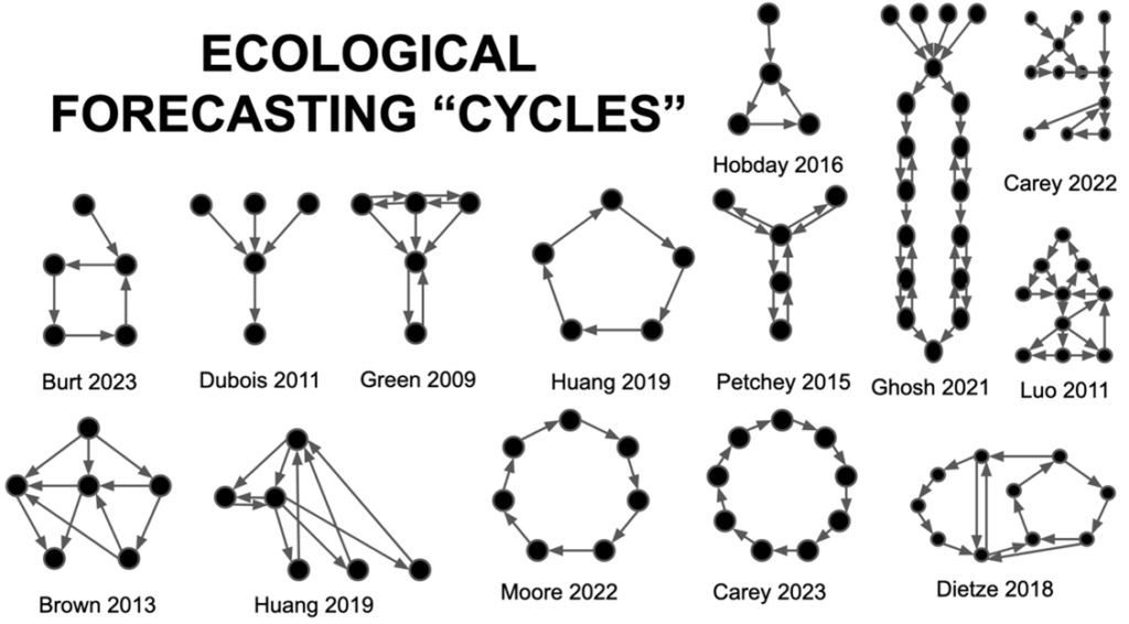
A cycle is not the only model for diagramming a forecasting system within its social network. Because I’m curious and a bit of a nerd, I recently reviewed a collection of papers with flowcharts diagramming their forecasting systems for ecological forecasting (Figure 1). You can see the “forecasting cycle” of Moore (2022) in the bottom center. There’s a range of configurations, including pure cycles, unidirectional flows, trees, meshes, nearly fully connected networks, and combinations of patterns. Personally, I like the one in the middle row, from Petchey, that looks like a flux capacitor.
Figure 1 Some examples of topologies of ecological forecasting systems, diagrammed from the figures provided in a subset of the papers reviewed. Each figure was distilled as a network graph based on nodes and edges indicated in the diagram.
I think I used the word “esoteric” earlier, but these so-called topologies of networks can be pretty informative. The shape of a network influences the flow of information and the resultant emergent knowledge. For example, stronger connectivity leads to faster consensus, and under certain conditions, regular networks (same number of edges and nodes) can increase the probability of reaching a less biased consensus (Fernandes 2023).
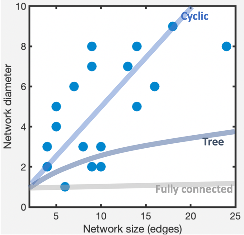
Some patterns emerged from an analysis of this collection of networks. For example, diameter appears to increase with network size at a rate similar to that for cyclic networks–i.e. networks that are basically circular, like the “forecasting cycle” (Figure 2). To find the diameter of a network, you look at the shortest distances between all pairs of vertices, and take the largest of those (wikipedia explains it in more detail). In principle, larger networks don’t necessarily have to have larger diameters. Fully-connected networks have small diameters no matter how large, and other shapes (e.g. tree-like networks) fall somewhere in between. But for this group of papers, larger networks had larger diameters, which means information has to pass through many steps to get through the social network. Multiple steps can lead to situations where the information is not well connected with other parts of the system. One potential explanation for this is that as we build larger forecasting systems that include more social components, we have a tendency to overlook the importance of the connectivity of these components.
Figure 2 The relationship between network size (edges) and network diameter (greatest shortest node-node distance) across eighteen forecasting topologies (r = 0.64, p < 0.005). In comparison are lines showing what this relationship would look like for cyclic (bi-directional) networks, tree-like networks, and fully connected networks.
To put this knowledge to use, we redrew the schematics that we use for our own forecasting projects at the Tandy Center for Ocean Forecasting (Figure 3). The idea was to have a system that is fully connected, without long chains of arrows that information has to follow to get from one place to another. This exercise emerged through the process of writing this EFI blog post on barriers to inclusivity. The system has properties that aim to reduce confirmation bias and to speed consensus (Fernandes 2023)–i.e. full connectivity and regularity (equal number of nodes and vertices). In practice, the idea is to include forecast users and those influenced by forecast-based decisions–i.e. communities–as participants throughout the process. More details on this approach are in a technical document (Record 2022).
We don’t know for sure that our approach will lead to more equitable outcomes in forecasting. That’s just the working theory. There’s an important trend in ocean science (and many geosciences) developing the role of co-producing knowledge through collaborations across social systems (Liboiron et al. 2021, Schreiber et al. 2022). The schematic devised here seeks to address issues of accessibility to forecasting science and practice, though there are tradeoffs to this approach (Record et al. 2022).
Ideas like, “Does the removal of urchins and perrywinkles lead to brown water?” should be able to propagate quickly through a well-connected network and be incorporated, or not, in a forecasting system. By centering communities of people who use or are influenced by forecasts, it can help to kickstart forecasts in places that might be under-resourced or otherwise outside of the mainstream of ocean forecasting applications. It might help avoid unintended consequences of forecasts. And it should get a community’s wide range of hypotheses and ideas into the mix faster.
Figure 3 Schematic diagram of the framework used by the Tandy Center for building forecasting systems. Arrows indicate two-way movement of information between any of the components of the framework, potentially multiple times.
Do you have your own sketch of what a forecasting system network should look like? Or are you encouraged to try to make one? I suspect there are lots of different configurations that could work in different circumstances. If folks are willing to share, I’d be happy to collect them and post in a followup blog post. You can send it to forecast@bigelow.org, with a subject heading “topology”, or share on the EFI #inclusion Slack Channel (if you are not on the EFI Slack group and would like to join, reach out to info@ecoforecast.org to be added).
Acknowledgements: The EFI Diversity, Equity, and Inclusion Working Group provided helpful feedback on the post during the January 2024 call. Participants included: Alyssa Willson, Anna Sjodin, Antoinette Abeyta, Jason McLachlan, Jody Peters, John Zobitz, Rachel Torres, and Saeed Shafiei Sabet
Hobday AJ, Hartog JR, Manderson JP, Mills KE, Oliver MJ, Pershing AJ, Siedlecki S. Ethical considerations and unanticipated consequences associated with ecological forecasting for marine resources. ICES Journal of Marine Science. 2019 Sep 1;76(5):1244-56. https://doi.org/10.1093/icesjms/fsy210
Liboiron M, Zahara A, Hawkins K, Crespo C, de Moura Neves B, Wareham-Hayes V, Edinger E, Muise C, Walzak MJ, Sarazen R, Chidley J. Abundance and types of plastic pollution in surface waters in the Eastern Arctic (Inuit Nunangat) and the case for reconciliation science. Science of the Total Environment. 2021 Aug 15;782:146809. https://doi.org/10.1016/j.scitotenv.2021.146809
McClenachan L, Record NR, Waller J. How do human actions affect fisheries? Differences in perceptions between fishers and scientists in the Maine lobster fishery. Facets. 2022 Feb 10;7(1):174-93. https://doi.org/10.1139/facets-2021-0030
Moore TN, Thomas RQ, Woelmer WM, Carey CC. Integrating ecological forecasting into undergraduate ecology curricula with an R shiny application-based teaching module. Forecasting. 2022 Jun 30;4(3):604-33. https://doi.org/10.3390/forecast4030033
Record NR, Pershing AJ. Facing the Forecaster’s Dilemma: Reflexivity in Ocean System Forecasting. Oceans 2021 Nov 12 (Vol. 2, No. 4, pp. 738-751). MDPI. https://doi.org/10.3390/oceans2040042
Record NR, Evanilla J, Kanwit K, Burnell C, Cartisano C, Lewis BJ, MacLeod J, Tupper B, Miller DW, Tracy AT, White C, Moretti M, Hamilton B, Barner C, Archer SD (2022) Benefits and Challenges of a Stakeholder-Driven Shellfish Toxicity Forecast in Coastal Maine. Frontiers in Marine Science. https://doi.org/10.3389/fmars.2022.923738
Schreiber MA, Chuenpagdee R, Jentoft S. Blue Justice and the co-production of hermeneutical resources for small-scale fisheries. Marine Policy. 2022 Mar 1;137:104959. https://doi.org/10.1016/j.marpol.2022.104959Willson AM, Gallo H, Peters JA, Abeyta A, Bueno Watts N, Carey CC, Moore TN, Smies G, Thomas RQ, Woelmer WM, McLachlan JS. Assessing opportunities and inequities in undergraduate ecological forecasting education. Ecology and Evolution. 2023 May;13(5):e10001. https://doi.org/10.1002/ece3.10001