
Date: March 23, 2020
Post by: Kathy Gerst1, Kira Sullivan-Wiley2, and Jaime Ashander3
Series contributors: Mike Gerst4, Kailin Kroetz5, Yusuke Kuwayama6, and Melissa Kenney7
1 USA National Phenology, 2Boston University, 3Resources for the Future, 4University of Maryland, 5University of Arizona, 6Arizona State University, 7University of Minnesota
In this series, we are asking: How might ideas from the social sciences improve ecological forecasting? What new opportunities and questions does the emerging interdisciplinary field of ecological forecasting raise for the social sciences? This installment engages with the relationship between the people producing forecast outputs and the people interpreting those outputs.
First, it is important to note that some forecast products have a specific and known user (e.g., the EFI-affiliated Smart Reservoir project producing forecasts for the Western Virginia Water Authority). Others are produced for public use (e.g., weather forecasts) or by a wide range of potential users, some of whom may be known, but others not. This is important because there is variability in how people perceive, engage with, and understand visual products. This variability was seen in popular media in 2015 when the picture of a dress went viral and people could not agree on whether the dress was gold and white or black and blue. What people “see” can vary based on differences in not only neurology, but also personal experiences and perspectives. For forecasters, this means that we should never assume that a visual product that means one thing to us will automatically have the same meaning for the people using it.
Using social science approaches to gain insights on how stakeholders perceive and use forecast outputs can improve the ways in which model outputs are visualized and shared.
One example where people contribute to the design and refinement of forecasts comes from the USA National Phenology Network (USA-NPN; www.usanpn.org). The USA-NPN collects, stores, and shares phenology data and information to advance science and inform decisions. To do so, USA-NPN engages stakeholders, including natural resource managers and decision-makers, to guide the prioritization, selection, and development of data products and tools. This happens through a deliberate effort to engage and seek input from existing and new stakeholder audiences by cultivating relationships that can lead to collaborative teams and co-production of products. In this way, data users are actively involved throughout the process of scoping and developing projects that meet their needs.
An example of a USA-NPN product designed with stakeholder input is the suite of Pheno Forecast maps (www.usanpn.org/data/forecasts); these maps show, up to 6 days in advance, when insect pests and invasive species are going to be in life stages that are susceptible to treatment. Interactions with end users after pilot maps were released revealed several opportunities for improvement.
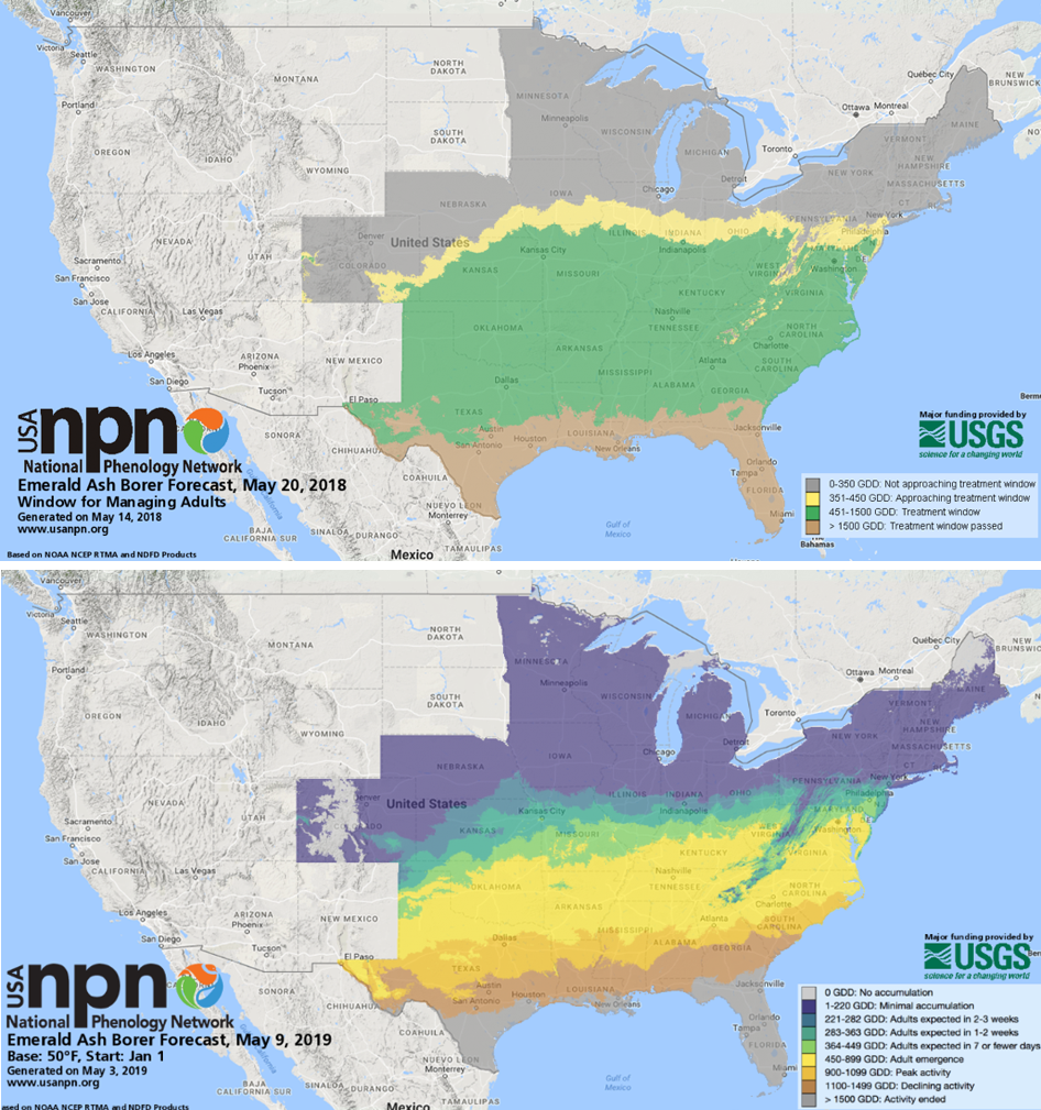
The original maps released in 2018 were focused on the “timing of treatment” –
that is, map categories portrayed locations based on whether they were
occurring before, during, or after particular treatment windows. Stakeholders
requested the visualized information
reflect life stages (e.g. eggs hatching or adults emerging) rather than
treatment window status (e.g. “approaching treatment window”), giving the end
user the opportunity to determine when (or if) to implement treatment (Figure 1). This visualization style also increased the
potential for the forecasts to be used by a broader community of people,
especially those with interests other than treatment.
In addition, some end users indicated that the original legend categories reflecting treatment window were too broad, and advocated for the use of narrower legend categories that allowed for more spatial differentiation among categories and more precise lead time before life stage transitions. Through consultation and the inclusion of stakeholders in the process, the NPN was able to harness the collective knowledge of the community to ultimately provide users with more nuanced and actionable information.
This case highlights both the importance of visualizations in communicating forecast information and the importance of recognizing that visualizations are more successful when they reflect a range of potential users and uses. Approaches such as stakeholder participation and forecast co-production are likely to increase the usability of forecast products and their associated decision tools.
Further reading
Additional resources will be updated in a living document that EFI is working to put together. We will add a link here once that goes live.
Academic Books and Articles
Books by Denis Wood and co-authors on the ideologies, power dynamics, and histories embedded in maps. These accessible books may be particularly interesting for those interested in how visualizations (maps) can be harnessed by different people to establish or reclaim power, shape the human-environment relationship, or project a particular vision of reality.
- Weaponizing Maps (2015): This book explores the “tension between military applications of participatory mapping and its use for political mobilization and advocacy”
- Rethinking the Power of Maps (2010): This book updates the 1992 “Power of Maps” and expands it by exploring “the promises and limitations of diverse counter-mapping practices today.”
- The Natures of Maps (2008): This book draws examples from maps of nature (or environmental phenomena) in order to reveal “the way that each piece of information [visualized in the map] collaborates in a disguised effort to mount an argument about reality” in ways that can shape our relationship to the natural world.
- The Power of Maps (1992): This book shows “how maps are not impartial reference objects, but rather instruments of communication, persuasion, and power…[that] embody and project the interests of their creators.”
Masuda (2009). Cultural Effects on Visual Perception. In book: Sage encyclopedia of perception, Vol. 1, Publisher: Sage Publications, Editors: In E. B. Goldstein (Ed, pp.339-343). link
This chapter is a good overview of psychology research on how culture can influence what and how we “see.” It is full of research examples and is written in an accessible way.
Burkhard, “Learning from architects: the difference between knowledge visualization and information visualization,” Proceedings. Eighth International Conference on Information Visualisation, 2004. IV 2004., London, UK, 2004, pp. 519-524. IEEE link
This paper is a quick and helpful overview of how a complement of tools can help us communicate either information or knowledge, drawing on tools used by architects (i.e. sketches, models, images/visions)
Chen et al. (2009) “Data, Information, and Knowledge in Visualization” IEEE. link
This paper is a good reference for the distinctions among data, information, and knowledge, and how these can and should be treated differently in visualization products. Especially useful for those interested in distinctions in how these topics are treated in the cognitive and perceptual space as opposed to the computational space.
Blog posts on “best practices in data/information visualization” from data science companies
Note: These practices underlie many of the visualizations produced and shared from the private sector and appear in advertising and media outlets—visualizations and visualization styles that will be familiar to most users of ecological forecasts
- From Oracle Data Science
- From GoodData
- From Toptal