
May 17, 2021 Panel Hosted by the Social Sciences Working Group
During this panel, the panelists shared recent experiments assessing the efficacy of ecological forecast visualizations and the development of a teaching module for undergraduate students to learn about visualizing uncertainty in forecasts.
Below you will find a list of the panelists and their backgrounds, a video recording of the panel with times listed when each panelist spoke, resources shared by the panelists, and answers to some of the questions we did not have time to get to during the Q&A session.
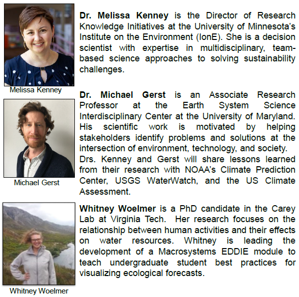
Our panelists were:
Recording of the Panel
Timing of Activities in the Video
- 0:00 Welcome, Overview, and Introduction of Panelists Kira Sullivan-Wiley (University of Notre Dame)
- 7:30 Panelists: Melissa Kenney (University of Minnesota, Institute on the Environment (IonE) and Mike Gerst (Earth System Science Interdisciplinary Center, University of Maryland)
- 41:11 Panelist: Whitney Woelmer (Virginia Tech)
- 51:43 Q&A Session moderated by Kira Sullivan-Wiley (University of Notre Dame)
Resources Shared by Panelists
Dasgupta A, J Poco, Y Wei, et al. 2015. Bridging Theory with Practice: An Exploratory Study of Visualization Use and Design for Climate Model Comparison. IEEE Transactions on Visualization and Computer Graphics, 21(9):996-1014. https://doi.org/10.1109/TVCG.2015.2413774
Gerst, MD, MA Kenney, AE Baer, et al. 2020. Using Visualization Science to Improve Expert and Public Understanding of Probabilistic Temperature and Precipitation Outlooks. Weather, Climate, and Society, 12(1):117-133. https://doi.org/10.1175/WCAS-D-18-0094.1
Harold, J, I Lorenzoni, T Shipley, et al. 2016. Cognitive and psychological science insights to improve climate change data visualization. Nature Climate Change 6:1080–1089. https://doi.org/10.1038/nclimate3162
Macrosystems EDDIE Modules
- www.MacrosystemsEDDIE.org
- Contact MacrosystemsEDDIE@gmail.com to test out Module 5, “Introduction to Forecasting” or Module 8, “Using Ecological Forecasts to Guide Decision Making”
- Full list of Macrosytems EDDIE Modules
- Module 1: Climate Change Effects on Lake Temperatures
- Module 2: Cross-scale Interactions
- Module 3: Teleconnections
- Module 4: Maro-scale Feedbacks
- Module 5: Introduction to Forecasting
- Module 6: Forecast Uncertainty
- Module 7: Confronting Forecasts with Data
- Module 8: Using Ecological Forecasts to Guide Decision Making
Questions for the Panelists
- The climate change map raises the issue of a potential tradeoff between on the one hand getting a key message across and on the other providing a rich and detailed picture of the data. Are these goals always in tension? How should designers think about multiple goals when constructing a visual?
Answered at time 52:17 in the recording
- How did you measure understandability of the graphics?
Answered at time 55:21 in the recording
- For the Climate Change indicators, how did you decide on what modifications to make and test?
Answered at time 56:50 in the recording
- Are you seeing an improvement in “big picture” thinking as a result of your Shiny app exercises?
Answered at time 1:01:21 in the recording
Additional input from Whitney after the panel: This is a great question, and something that we really hope to see from our testing results. As students often have to think about nitty gritty modeling and data problems, these exercises push students to take a step back and think about application and use of data products in a way that connects them to the “big picture.” As a result of faculty testers who we are recruiting for Fall 2021 (see questions above for more information on being a tester), we are aiming to answer this question, which will directly contribute to scientific research on how teaching modules can improve students’ understanding of real-world ecological problems.
- Might preference for perhaps “prettier” graphics be important in cases where it is valuable to have graphics shared on popular media?
Answered at time 1:02:58 in the recording
- Does it take a long time for users of the old graphics to understand / adopt the new graphics?
Answered at time 1:08:45 in the recording
- Does your team include usability specialists (e.g., user researcher and user experience designers)?
We are experts in decision support science which is a type of “usable science” research. Thus, in addition to our knowledge of the scientific literature on design practices, what we usually bring to the collaboration is experience on eliciting user/stakeholder needs and setting up the experiments to test usability.
Our team has not usually done the visualization modifications. That is because our partner or funder usually has someone on staff that we work with that has design experience. Collaborating with an on-staff designer is useful because the designer knows the product history and the user base. We also take this approach because any changes they make are more likely to be accepted and able to be operationalized because they know the design and operational constraints of the organization/agency.
- If we use this course module, is there an evaluation tool that you are using? Is there a way to contribute to a larger evaluation dataset to help with improving this for the whole community?
We are currently recruiting classrooms to help us evaluate the module (see Question 9 for more details about how to be a faculty tester)! This will help us measure the effectiveness of our teaching materials and improve them for future iterations of the module with new classrooms. Assessments such as this for other modules have directly led to scientific articles (see citations below) which help improve the ways in which we teach ecological, data-driven concepts to undergraduate students. Contributing to this module will also help improve our understanding specifically regarding data visualization of uncertainty and stakeholder application and how best to teach those concepts to undergraduates, which will benefit the field of ecological forecasting as a whole.
Carey, CC, KJ Farrell, AG Hounshell, K O’Connell. 2020. Macrosystems EDDIE teaching modules significantly increase ecology students’ proficiency and confidence working with ecosystem models and use of systems thinking. Ecology and Evolution, 10(22): 12515–12527. https://doi.org/10.1002/ece3.6757
Farrell, KJ, CC Carey. 2018. Power, pitfalls, and potential for integrating computational literacy into undergraduate ecology courses. International Journal of Business Innovation and Research, 17(3): 7744–7751. https://doi.org/10.1002/ece3.4363
Hounshell, AG, KJ Farrell, CC Carey. Macrosystems EDDIE teaching modules increase students’ ability to define, interpret, and apply concepts in macrosystems ecology. In Review at BioScience.
- Is the EDDIE module publicly available? Can other groups use/ test it?
As the module is still in beta-testing mode, we are currently soliciting faculty testers that can help us collect faculty and student data on module effectiveness for future revisions. After testing in Fall 2021, all module resources will be publicly available at https://serc.carleton.edu/eddie/macrosystems/modules, where our other Macrosystems EDDIE module resources are hosted. If you are interested in being a faculty tester, we encourage you to email MacrosystemsEDDIE@gmail.com and we are happy to answer any questions you have may have. We will be broadly sharing the app after our last round of testing and will begin the process of recruiting testers formally throughout June.
Being a tester entails only a few extra steps on top of teaching the module in your course, including student completion of both a pre- and post-module assessment survey. The results of these assessment surveys will help us to quantify students’ learning as a result of completing the module. Contact us at macrosystemsEDDIE@gmail.com with any questions or to sign up to be a faculty tester.
- Is there a resource the speakers would point to, that summarizes viz best practices?
Here is a bibliography of resources for data visualization best practices that the EFI Social Science group has put together. You can also find these resources in the Ecological Forecasting Initiative Bibliography Zotero Group Library. Use the Filter Tags section in the lower left-hand corner of the library to select the “EFI Visualization Paper” tag to bring up all the references provided in the link above.